Showing posts with label TECHNIQUES. Show all posts

Tuesday, 18 April 2023

Stampin' Up! card ideas using the silhouette technique

Stampin up UK Silhouette technique card idea
 
Here’s a fun technique which doesn’t require any special equipment – and can help you get more mileage out of your Stampin’ Up!® stamps.
 
It’s called the silhouette stamping technique and is so simple but is often overlooked.
All you do is stamp any outline image in black, then colour it in... black. This creates a silhouette and gives you a whole new look for your stamped image. 

Thursday, 15 October 2020

Trimming the Town international blog hop

Trimming the Town Home Together Dies Stampin Up

It’s another exciting day in the world of Stampin’ Up!® crafting as we have another international blog hop for you so a warm welcome to everyone, particularly those who are here for the first time.  
 
Trimming the Town Home Together Dies Stampin Up

This time we are showcasing the Trimming the Town Suite, which is a fabulous suite in the August-December Mini Catalogue.

It’s a very special suite as the stamp set, Coming Home, as well as the Coming Home Bundle, raises money for adoption and fostering charities. I have this gorgeous set and have used it in this blog post here.  

And the Designer Series Paper, which I haven’t used today but made great use of in these projects, is currently available at 15% off until the end of October, so make sure you don’t miss that!

In fact, I have the whole Suite (that happens more and more lately!) but today I particularly want to concentrate on the beautiful Home Together Dies because I have been using these recently in my events. 
 
All my events are currently held on Zoom, which is the closest we can safely get to a real craft class right now, and I like to offer a variety of events to suit all budgets, which often means creating projects based on dies, which I can cut in advance. For my October Crafty Friday event, where we enjoy playing with techniques, we made two cards:
 
Trimming the Town Home Together Dies Stampin Up

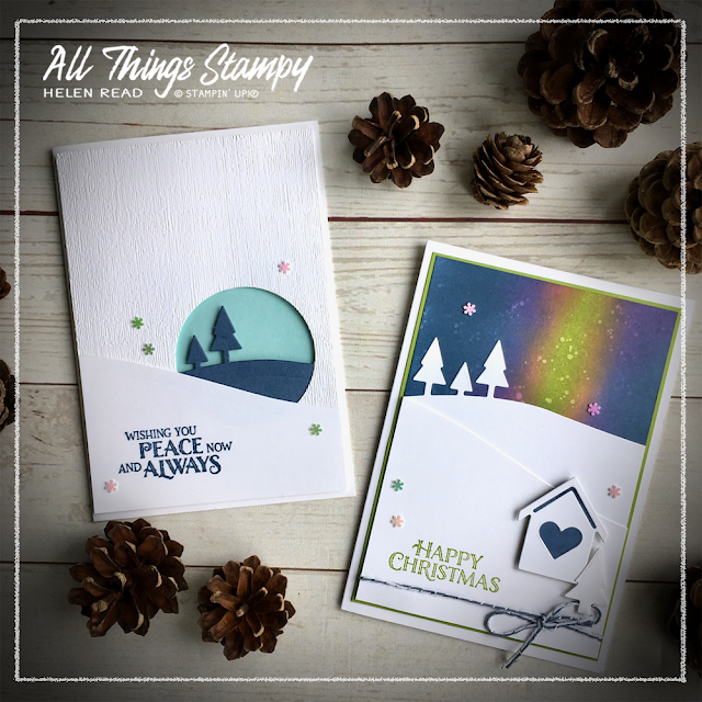
We eased ourselves in gently with this clean and simple white card, which draws the eye into a pair of trees on a hill. 
 
Trimming the Town Home Together Dies Stampin Up

The layer with the circle is also embossed using the Subtle 3D Embossing Folder, which is one of my favourites. I also know that many of the ladies attending had that folder, and those who didn’t could use something equally neutral.
 
Trimming the Town Home Together Dies Stampin Up
When die-cutting and embossing the same piece, make sure you do the die-cutting first. Otherwise, the cutting process will squash your lovely embossing.

I stamped this lovely sentiment from Yuletide Pasture in Misty Moonlight. I love how Misty Moonlight goes so beautifully with one of my favourite colours, Pool Party.

The card is finished off with these gorgeous Adhesive-Backed Snowflakes which I discovered recently. I actually bought them for a November class but couldn’t resist opening them early and have since had to re-order. Honestly, just buy them; they’re so delicate and subtle. 
 
Trimming the Town Home Together Dies Stampin Up

The ladies asked me why we’d started with the simpler card instead of this Northern Lights card which followed. The answer was because the Northern Lights card is sponged and I really didn’t want inky fingers on a such a clean, white project!

I love the Northern Lights technique. It’s one of those which turns out different every time, so it’s not for those among you who like order and predictability in their crafting!

You begin by sponging a couple of stripes, diagonals or smudges on your Whisper White cardstock using a bright colour or two. I’ve used Granny Apple Green and Magenta Madness. Make sure you fully blend them into each other as you don’t want to see any white cardstock through. 
 
Trimming the Town Home Together Dies Stampin Up
 
Next sponge around them using a dark blue ink – I used Misty Moonlight. And again, make sure you blend in well to the bright colours so you don’t get any gaps. You’re aiming for full colour saturation here, so don’t worry if you go over some of the pink/green.

Trimming the Town Home Together Dies Stampin Up
If in doubt, just keep going. If you’re not happy with the results (and everyone reaches this stage in the Northern Lights project), just plough on and add more ink. It will work out in the end, trust me.

To add a wintry feel to the sky, we then splashed it with clear water. This is another favourite technique of mine. You can do it to any sponged or brayered background; just take a fine paintbrush with a little water, hold it over the project from about 10cm away and tap the top to flick water on it. If it looks like nothing has happened, just wait a few seconds to allow the ink to lift and you’ll see magical snowflakes appear in front of your very eyes. If you don’t just repeat the process. But be warned: if your paintbrush is too big or too full, you will get great big splashes instead of delicate dots.

Once you have your Northern Lights background you can do whatever you like with it. We added a snowy hill from the Home Together Dies, along with a little house, a greeting and some baker’s twine from the Flowers for Every Season Ribbon Combo Pack. And, of course, some of those must-have snowflakes, too!

Trimming the Town Home Together Dies Stampin Up

I hope you have been inspired by my Trimming the Town projects. Please head on over to the rest of the blogs in the hop for yet more inspiration. 
 

Friday, 19 October 2018

Moody blue Christmas


Want to make a lovely night-time snowy background like this one? It's easy - and you don't need any special equipment; just ink, sponges and water.

All I did was sponge the two colours – Pacific Point and Pool Party – onto Whisper White cardstock, then splash it lightly with water. The water absorbs the ink, leaving the snowy effect. You can dab any excess water off with a piece of tissue if necessary.

I used the Stamparatus to stamp Winter Woods on top in black ink, mainly so I could stamp again and again to get a really dark black image.  I punched a hole out and stamped the greeting on the card blank behind, finishing off with some black baker's twine and a bit of festive bling. Hope you like it!


Monday, 17 September 2018

Winter Woods layered ink project


This is a lovely Stamparatus technique which I found thanks to Patty Bennett's great video tutorial. I didn’t have all the green markers I needed so incorporated some ink sponging, too.

I used one of my favourite stamp sets of the moment, Winter Woods, which is in the Autumn/Winter catalogue and is just perfect for loads of occasions, not just Christmas. It goes brilliantly with the Wood Textures Designer Series Paper, too... all of my favourite things in one project!


Friday, 13 October 2017

Eclipse cat with Wood Words


Eclipse cards don't have to spell out a word, as I showed on Wednesday. Here's another version of the eclipse concept, using the fabulous cat punch.

This was one of the cat punch projects we made at my Caturday Live event last weekend. The Wood Words bundle, Wood Textures Designer Series Paper and Copper Trim all go very nicely with this punched cat I think. And it's so great to have thick Very Vanilla cardstock to make our card bases with now - such a great addition to the catalogue.

Wednesday, 11 October 2017

Hometown Greetings eclipse card


You don't have to use letter dies to make an eclipse card - this one uses the Hometown Greetings dies, along with the Snowflake Sentiments stamp set... which handily has a little swirl which works just as well as a wisp of smoke.

I love the clean simplicity of this project - and so did the Crafty Friday ladies last week.

Monday, 9 October 2017

Snowflake Sentiments eclipse card


No Mix It Up Monday today, sorry - computer woes coupled with a busy weekend have made it a project too far. But I can show you this fun Eclipse card which we made at my Crafty Friday event last week.

This card style seems to be de rigueur at the moment so I thought I may as well hop on the bandwagon and join in the fun. It's really easy to do - you just stamp your background (or use DSP), then die-cut your chosen letters.Stick the background to a darker piece of cardstock and then pop up the letters so you get this cool 'drop shadow' effect. Done!

And here's one I made earlier, with lighter ribbon...


Wednesday, 19 July 2017

Glittery embossing on Happy Birthday Thinlits


How’s this for a different look with the same stamp set? For this project, I took inspiration from another Artisan Design Team demonstrator (aim high, that’s what I always say), Paula Dobson. It was her gift bag which inspired me to create this funky card; the black really makes the colours pop.

We made this card at last week’s Crafty Friday event, which is a really relaxed class where we often try different techniques. This was actually the only card we made in the session, because there were many steps.

For the greeting, we began by painting some watercolour paper with bright colours – I used Melon Mambo and Lemon Lime Twist. When this was dry, we die-cut it using the Happy Birthday Thinlits die. It looked pretty fab, and you could leave it there, but we were having too much fun to stop, so decided to do some glittery embossing  on top.


We Versamarked the whole piece and added a mix of embossing powder and Dazzling Diamonds glitter to create a shiny and sparkly effect. It looks really cool. If you do this, keep your mix made up ready – I use about 60% embossing powder, 40% glitter (roughly!) but be prepared to keep topping up with embossing powder, as the glitter will begin to take over.

The background is stamped in Craft Whisper White ink and, in the absence of ribbon, I added a flower which was stamped on the leftover piece of watercolour paper. Ooh, that would have looked nice embossed, too.

Wednesday, 21 June 2017

Daisy Delight with the smoosh technique


This was my first time trying the “smoosh” technique and, naturally, I was instantly hooked. Anything that creates a watercolour effect is usually a hit with me!

I found the instructions on Patty Bennett’s blog but, in brief, you simply wet a piece of watercolour paper, then use a clear block as a stamp... ie stamp the block onto your pad and then “smoosh” it around the wet cardstock. Repeat with a second and even third colour.

For these thank you cards, I used Lemon Lime Twist and Emerald Envy to make a gorgeous colourful green background. I then die-cut them using the Stitched Shapes Framelits Dies, stamped a greeting (from Pieces & Patterns) in Tranquil Tide, inking the stamp with a marker as I only wanted part of it, and added a punched daisy from Daisy Delight. These were supposed to be quick cards, but they didn’t turn out that way!


Wednesday, 22 February 2017

Hexagons Dynamic Embossing Folder gets the ombre look


One of my favourite products from the Spring/Summer catalogue is the Hexagon Dynamic Embossing Folder, as it’s so versatile. It goes with masculine projects, can be used to create honeycomb for bee projects, chicken wire to go with everybody’s favourite Sale-a-Bration set, Hey Chick... and here I’ve used it on a more feminine project.


It was inspired by a project I saw by the hugely talented Kristina Werner and uses a favourite technique of mine; watercolouring.


I began by creating an ombre effect on the watercolour paper. This is really simple: I wet the paper, then loaded a brush with diluted ink (Emerald Envy, Flirty Flamingo, Peche Fraiche) and swiped across the width. Then, instead of adding more ink, I wet the brush with clear water. This dilutes the colour so you get a graduated effect as you work down the paper. Once it was almost dry, I embossed each piece, then turned them around so the darker colour was at the bottom to create these fun projects.


This last one also has a watercoloured ombre background behind the balloon. The dies come with three wide bands, which you can use to create a striped effect to your balloon. I used the darker stripe at the top, to make it stand out from the paler sky.

If you wish to purchase the whole bundle (stamps and dies) instead of just stamps, these are the codes you need:

Lift Me Up Bundle
Wood mount: 144711
Clear mount: 144712


Thursday, 19 February 2015

Die-cut butterfly on watercoloured texture paste background


First things first: when using these fabulously intricate butterfly dies, always sandwich a piece of wax paper (or greaseproof if you can't find it) between your die and cardstock. It will make a world of difference when it comes to popping out the shape! You may or may not be able to see that I inked the edges of the butterfly slightly with the Silver Encore ink pad, to pick up the vague hint of silver on the background. 

For this project I was having a play with texture paste, in readiness for my upcoming All-Day Craftathon (now fully booked). We’re not taking on anything this complicated but it was fun having a go. I used the stencil from the Build a Banner Simply Created Kit (p2013 of the main catty). Here’s how to get the same effect:
  • Create your own texture paste using 1 part cheap white glue, 1 part cheap white paint, 2 parts cornflour.
  • Make a spreader from a piece of thick cardstock or chipboard and stencil the paste onto your cardstock (watercolour paper would have been better than Whisper White but it worked ok)
  • Allow to dry thoroughly.
  • Using a lot of water and the ink from the lids of your ink pads, paint a graduated background, allowing the colours to spread into each other. I went slightly darker around the edges but didn't worry too much about a pattern. 
  • Allow to dry thoroughly and then lightly brush with Silver Encore ink pad
  • Finally, it's ready to use as your card background. 


125576s
125576

Wednesday, 21 August 2013

Wetlands with "painterly" background


Last night was my fur and feathers fundraiser and it was a lovely relaxing evening. I and the cats at Woodland Nook Cat Rescue are very grateful for the donations of food and cat litter, which were the "tickets" for the prize draw. And £5 from every registration fee will be donated to the shelter, too. Thank you!

We made two cards, each using a different background technique, plus a box of notecards. I was a bit unsure that everyone would get finished but they all did – with time to spare!

This was one of the cards we made, shamelessly CASEd from demonstrator Nicky Dexter. The technique is a little daunting but I urge you to have a go.

All you do is take a piece of Whisper White cardstock and “swipe” your ink pad across it. It’s actually easier with the old-style pads but you get some lovely effects with the new firm foam pads, too. Here I’ve used Soft Sky (what else?) for the sky, a swipe of Smoky Slate across the centre and some Crumb Cake or Sahara Sand (sorry, can’t remember) across the lower section of the card.

It looked HORRIBLE but I persevered and stamped on the sandpipers… and then all of a sudden it had a painterly quality and looked exactly like a beach with clouds in the sky. Great for a masculine card, I think – or if you want to send one to me, as I absolutely love beach scenes.

Stamps: Wetlands
Cardstock: Baked Brown Sugar, Basic Black, Whisper White
Ink: Soft Sky, Smoky Slate, Crumb Cake (probably), Black Stazon
Accessories: Linen Thread

Sunday, 29 May 2011

Another use for the Top Note Die - and the Mother of Pearl technique


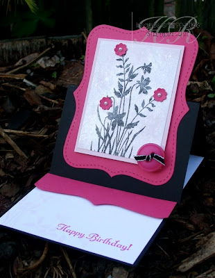
You know how I said you absolutely MUST get the Top Note Die? Well, here’s another reason: easel cards! Here are two easel cards from my May workshops; the first one, with the black, was the demonstration card, and the pink and white one was the Make & Take.

Making easel cards is very easy. All you do is cut your A4 cardstock in half lengthways, so measuring across the short edge at 10.5cm. Then you fold it in half (score at 14.8cm) and then, on one half, score in half again (at 7.4cm). 

There are two things you need to remember with easel cards:

1. The flat base must have something raised on it, to stop the top half of the card sliding down. Here I’ve used a strip of cardstock popped up with Stampin’ Dimensionals. You could also use brads, buttons etc – as long as there’s a “step”. 

2. You need to make sure the top folded piece sits down – my early efforts saw the top piece floating in mid-air. To make it sit down, you can add weight such as buttons etc, but by far the easiest way is to ensure that the score-lines are well creased. The important one is the one at the back, which is the halfway score. Get your bone folder on it and crease it well and you’ll have no problems!

Now, I’m not sure if you can see from the photo but on the first sample there’s a rather groovy technique. It’s called the Mother of Pearl technique and I learned it from Impressions magazine, the monthly newsletter sent by Stampin’ Up!® to all demonstrators.

You will need Whisper White cardstock, Frost White shimmer paint, a pale-coloured ink pad, Black StazOn® ink pad and a piece of cling film scrunched up into a ball.

  1. Put a few drops of shimmer paint onto a paper plate.
  2. Using the scrunched-up clingflim, dab the paint onto your Whisper White cardstock.
  3. Allow to dry.
  4. Once dry, you can add coloured ink either by sponging or brayering (brayering is quicker, but sponging will allow you more precision if doing lots of different colours). I brayered Pink Pirouette ink over the top for a really gentle effect.
  5. Now you can stamp on this very cool background – but you must use StazOn® ink because ordinary ink pads won’t work on what is now a non-porous surface. 
Have fun!

Stamps: Just Believe, Something to Celebrate (hostess set)
Cardstock: Whisper White, Basic Black, Melon Mambo, Pink Pirouette
Ink: Pink Pirouette, Melon Mambo, Black StazOn®
Accessories: Frost White shimmer paint, brayer, Itty Bitty Punches, Top Note Die, Scallop Edge Punch, Basic Pearls, Big Designer Buttons, 1/8” taffeta - Basic Black

All products by Stampin’ Up!®            

Sunday, 20 March 2011

Joseph's Coat technique


The final project from my Brayering Class used the Joseph’s Coat technique. Here’s what you do:

  1. Brayer random colours over a piece of glossy cardstock. You can sponge the ink on if you prefer to be more precise
  2. Tap or swipe all over with the Embossing Buddy® - this really does make a big difference
  3. Stamp solid image in Versamark and clear emboss
  4. Brayer over the top in a darker colour – here I’ve used Not Quite Navy
  5. Gently wipe away the ink from the embossed areas

And that’s about the size of it really. This, I believe, is called a tent topper card and, while it’s a novel idea, this one was born from me finding a piece of Pear Pizzazz in my scraps box that was just the right size to make the card base. The leaves along the bottom are stamped in Versamark. Pear Pizzazz would have done the same job.

And here is a version which didn’t turn out as well as I’d hoped. As you can see, I haven’t stamped firmly enough, so the image is incomplete (if this was a small amount, you could fill in the gaps with a Versamarker). You can also see speckles all over where the embossing powder has spread beyond the image – this is because I forgot to use the Embossing Buddy®! Told you it works!

Stamps: Just Believe
Cardstock: Pear Pizzazz, Not Quite Navy, Very Vanilla, Glossy White
Ink: Not Quite Navy, Versamark, various Subtles and Brights
Accessories: Scallop Edge Punch, Taffeta Ribbon – Daffodil Delight

All products by Stampin’ Up!®            

Sunday, 13 March 2011

Brayered card


It’s still a bit gloomy but it was bright enough for a photo so, as promised, here is the first of the projects from this weekend’s brayering class. We made three cards, using different brayering techniques.

For this card, I had the brainwave of providing black and white layers, so that each person could make the card in colours of their choice. We started by changing the colour of the ribbon, which started out as Basic Black with Very Vanilla stripes (or Very Vanilla with Basic Black stripes, depending on which way you look at it). We placed a small piece (you know me, when it’s one of the more expensive ribbons, it’s only ever a small piece!)  directly onto the ink pad and brayered it to squish it into the ink. If necessary you can turn over the ribbon and do it again on the other side. This is a brilliant way to colour your ribbon, especially if you don’t have the correct colour marker. However, it does take absolutely AGES to dry. We did this right at the beginning of the class and put the ribbon on one side to dry, for assembling at the end. But the ribbon pieces still weren’t dry, even when we had a go at them with the heat gun.  In fact, my sample card has ink stains on the crease, where the ribbon has bled onto it.

Onto the brayering... we were brayering onto glossy cardstock, which gives fantastic results. What’s more, the glossy cardstock is on special offer at the moment, in the March Frenzy promotion. That was a happy accident for me, as I’d planned to use it long before we received details of the offer.

We each chose two inks, mostly from the Subtles range, as here. Some people picked brighter colours and they looked absolutely fabulous. One of my favourite combos was Judie’s Wild Wasabi and Rose Red.  Here I’ve used Daffodil Delight and Baja Breeze.

We stamped onto the brayered backgrounds using Black StazOn® ink, which is ideal for non-porous surfaces such as glossy cardstock and gives a really crisp, dark image. This second picture here shows what it looks like stamped in Basic Black ink.  This ink is perfect for Whisper White cardstock, but not so great on glossy, as you can see. You can also see where I had a go at some white highlights with a gel pen, but it didn’t quite work out. I make mistakes so you don't have to! 

And you can’t see it but the card base is Shimmery cardstock, which is absolutely gorgeous. It’s shimmery on both sides and really sparkles in the light. It makes really nice card bases as it’s heavier than our Whisper White... and it, too is part of the March Frenzy promotion.

Stamps: Just Believe
Cardstock: Shimmery White, Glossy White, Whisper White, Basic Black
Ink: Jet Black StazOn®, Basic Black, Daffodil Delight, Baja Breeze
Accessories: Brayer, wide striped ribbon – Basic Black, Neutrals buttons, linen thread, Word Window Punch, Modern Label Punch

All products by Stampin’ Up!®

Tuesday, 8 June 2010

Rock chick card with punched skull


As promised, here’s the punched skull card I made. 
This is a black card front mounted onto a white card base, but you could use a full black card base.

Please see yesterday's post for how to make the punched skull. 

I distressed the black cardstock to make it look like handmade paper. To do this, I wet it all over and rubbed away the top layer. It turned my thumb black for quite a long time! Allow to dry.

Another – arguably better – way of doing this is the faux suede technique. This gives a less rugged surface and doesn’t waste any cardstock if you’re lucky. To do this, curl your cardstock around a bone folder or scissors, just as you curl gift ribbon. If you curl it repeatedly in different directions, it should begin to separate. As soon as you can get a fingernail between the layers, slowly begin to separate them. If they don’t come apart, go back to the curling. Eventually you should be able to get the layers apart and have two pieces of faux suede cardstock!

I sprayed my black cardstock liberally with Champagne Mist shimmer paint mist (click here to see how to make it - thanks Monica!). This gives it a lovely sparkly effect.

The strip of Night & Day paper is brayered all over with Rich Razzleberry ink. You have to allow this to dry for a few minutes.

I fixed eyelets and brads along the edges of some Rich Razzleberry cardstock. I was aiming for all black but picked a white one up by mistake. I noticed in good time but popped it in anyway to see what it looked like and decided I really liked the fact that it’s different.

Next I distressed the edges of the coloured cardstock with a pair of scissors. The longer you do this, the more distressed they will be – just stop when you are happy with the results.

Using a sponge dauber, I applied Platinum Shimmer Paint to the swirl stamp from Tiny Tags and stamped on the distressed Basic Black cardstock. The hearts are stamped on scrap black cardstock and punched them out using the small heart punch.

I assembled the layers using Tombow Multi – I needed a strong adhesive to attach the black layer to the white card base as the black cardstock had gone quite wrinkly. If you use the more accepted faux suede technique you may not have this problem.

Finally, using the sponge dauber and without adding any more shimmer paint, I sponged around the edges of the entire card.

Stamps: Tiny Tags
Cardstock: Whisper White, Basic Black
Paper: Night & Day
Ink: Rich Razzleberry
Accessories: Rhinestone brads, Stampin’ Pastels, sponge daubers, Platinum shimmer paint, Champagne Mist shimmer paint, Stampin’ Write journaling pen, black pewter and white eyelets/brads, brayer, Crop-A-Dile
Punches: 1 ¾” circle, large oval, 1” circle, Boho Blossoms, Word Window, ¼” circle (optional)

All products by Stampin' Up!®

The small print

This is my personal blog and my sole responsibility as an Independent Stampin' Up!® demonstrator. All images are © Stampin' Up!® All content including photographs, projects and text are © Helen Read, unless otherwise stated. Please feel free to copy my ideas for your personal use and inspiration - if you are a SU demonstrator you may use these ideas for your events but please give credit where it is due. Please do not use my ideas for monetary gain, competitions or publication. The images on this blog - including blog buttons - should not be copied and used elsewhere on the internet or on CDs.