Sorry I can't update the blog right now. Please find me on Facebook
Tuesday, 16 August 2022
Let's Set Sail Slimline card ideas – with tips for lining up stamps with your punch
Tuesday, 4 January 2022
In The Moment cards coloured with Stampin’ Blends
It’s new Stampin’ Up!® Mini catalogue time! And I have a beautiful stamp set from the new Jan-June Mini Catalogue to show you today. The set is called In The Moment and is in the same style as other popular sets we’ve had such as Beautiful Moments and Beautiful You. It’s a very popular style with good reason – the images are beautiful and so satisfying to colour in.
Browse the new Jan-June Mini Catalogue here
There are three images in the set but
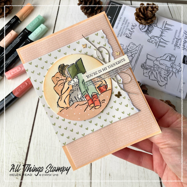
so far I have only used the lady reading her book in bed with her canine
companion, probably because that matches my winter mood!
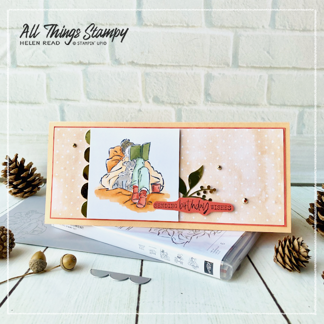
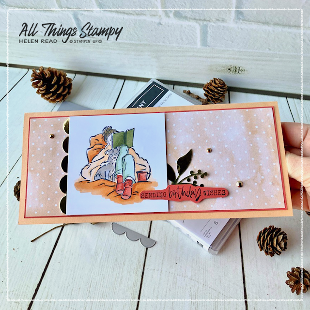
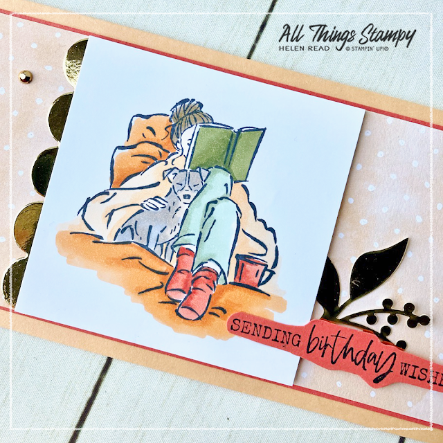
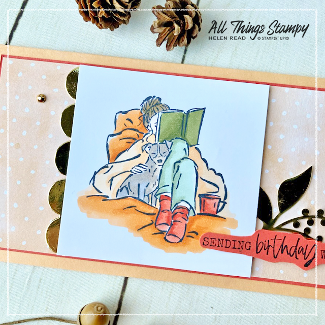
I made this slimline card for my lovely friend Mrs B, whose birthday was yesterday. She loves reading and has a beautiful whippet but this pup is the nearest I could find. I made this card to fit one of our gorgeous new slimline envelopes, and decorated it with a panel of Hand-Penned Designer Series Paper to match the Pale Papaya background.
The image is coloured using Stampin’ Blends, which I don’t use often enough, and the gold elements are from the Expressions in Ink Ephemera Pack... including the scalloped strip which I cut from the leftover pieces using the new Brilliant Rainbow Dies.
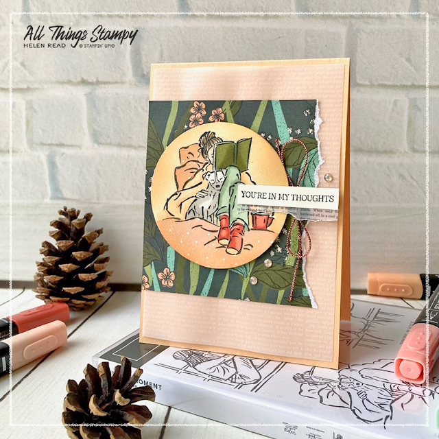
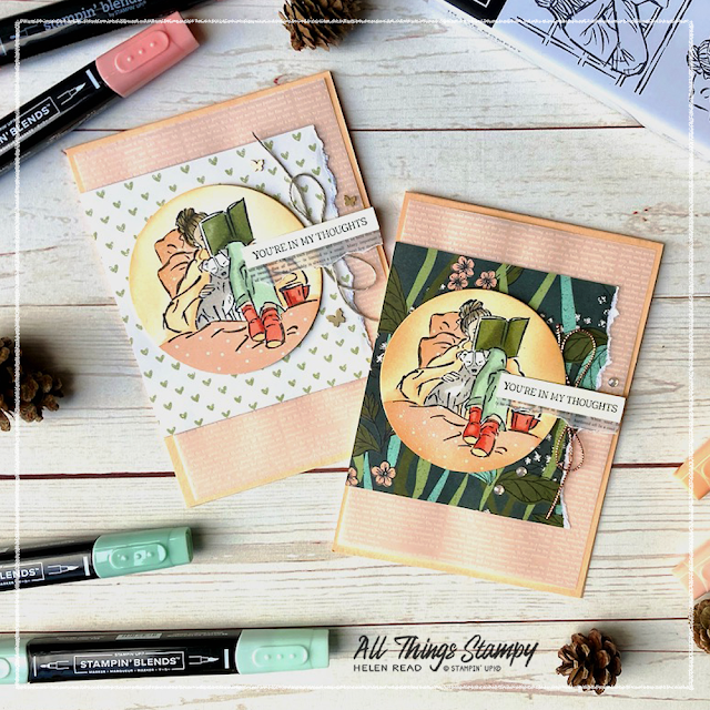
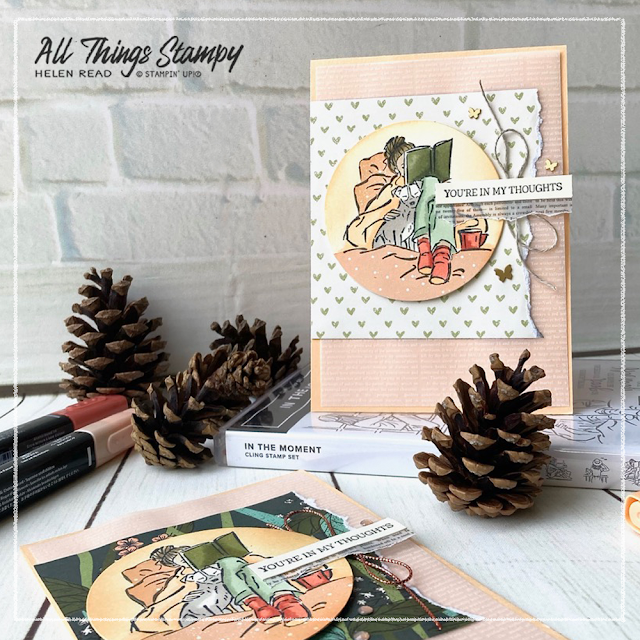
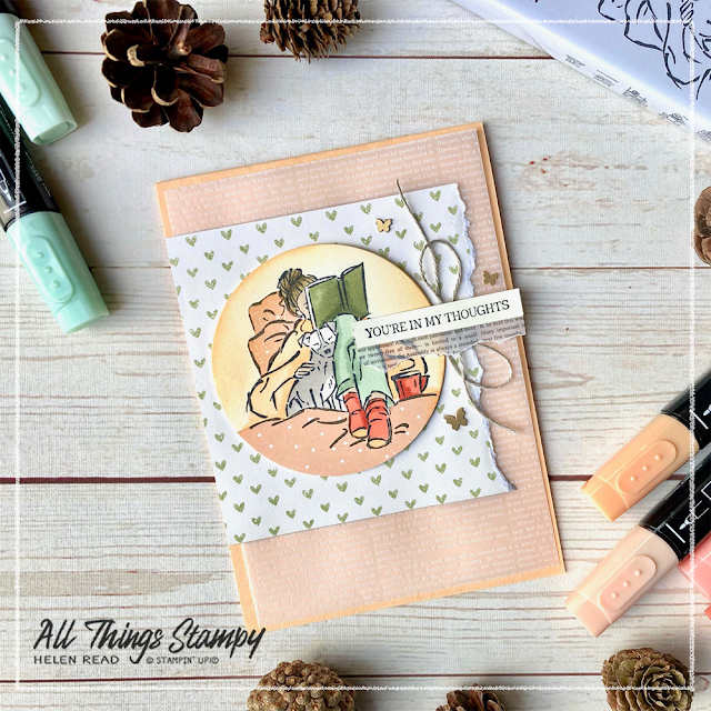
The standard-sized cards were inspired by US Stampin’ Up!® demonstrator Chelsey Christensen, who demoed a similar card at a demo event towards the end of last year. I made mine as part of my demonstration at my annual Twixmas Party last week. This was held on Zoom and guests could vote on various elements to help me create the card.
To begin with they voted to use the image of the lady reading her book... which is another reason all my projects are made with this design! I was glad they did though, as it gave me the opportunity to show them how fab it looks with the paper piecing technique.
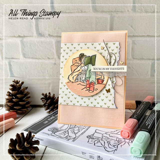
I stamped the image once on the Very Vanilla circle and again directly onto this Pale Papaya piece of Designer Series Paper with its delicate polka dot pattern. The DSP image was cut out and pieced on top of the Very Vanilla circle so the duvet cover and pillows could feature this pretty dotted design.
After I’d coloured the image and stuck the DSP down, I went around the edges with a Blending Brush and some Pale Papaya ink.
This
Designer Series Paper is from our fabulous new Sale-a-Bration
collection and is called Daffodil Afternoon; it features bold floral
illustrations on one side of the papers, with more subtle designs on the
reverse.
Browse the Sale-a-Bration brochure here
For the torn rectangular panel, I gave guests a choice
of the dark green side with its lush foliage, or the reverse pattern of
delicate green hearts. They chose the little hearts, as I suspected
they would, so I had already created a version using the darker side to
show them, too.
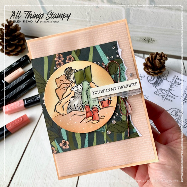
Underneath this is a panel of new vellum called Layering Designs. This features black and white printed designs, including this fine print which I’ve used in white across the base of the card, and in black as a tiny element beneath the greeting.
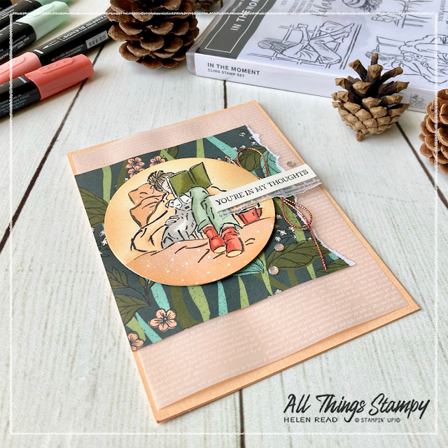
On
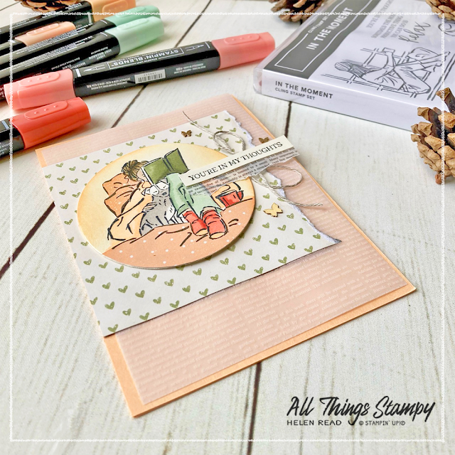
this version of the card, I coloured some silver Simply Elegant Trim
using a dark Calypso Coral Stampin’ Blend. To be honest, while this
works well, I don’t think it did my marker much good so I would only use
this technique in small doses – and be very gentle if you do try it.
This version of the card uses linen thread because I didn’t want to go down the colouring route again and, frankly, linen thread goes with everything.
If you are in the UK and would like to order, please
visit my store and, if you use the current host code RNU3JCR9, I’ll send you a thank you gift in the following month.
Wednesday, 8 July 2020
Forever Greenery - letting the dies and DSP do the work
Staying with the Forever Greenery theme... I realised I never showed you the Make & Take from my catalogue launch party last month. It's a simple note card decorated with just die-cut pieces and Designer Series Paper, to allow me to send out prepared kits for guests. They used their own stamp set to stamp a greeting.
The Forever Fern stamp set has been consistently in the top-selling stamp sets since the launch of of the new Annual Catalogue and with very good reason. Do you have yours yet?
Friday, 4 October 2019
Shabby chic Nature's Beauty cards for a team celebration
I’m still getting lots of mileage from the Nature’s Beauty stamp set - which is raising money for Mental Health Europe and other mental health charities around the world.
I used it here to celebrate my team members this month and combined it with Countdown to Christmas - can you even tell I've used a festive stamp set?
I've repeated the background stamp in Mint Macaron on the card base of the same colour. By twisting and turning the stamp, it doesn't matter if I overlap or the image doesn't quite fit because it gives it a vintage “shabby chic” look.
Monday, 26 August 2019
Feels Like Frost? Not with these cheery colours
Silver Designer Series Paper is very hard to photograph, especially when you're wearing an orange T-shirt. Unfortunately, I didn't notice this until AFTER I'd sealed all the envelopes with these cheery cards.
They’re going out to my team members who achieved qualified status – they get a £30 voucher, too, so I’m sure they'll be pleased to receive them!
I used the new Feels Like Frost Designer Series paper, which has a photorealistic image on one side, and shiny silver designs on the other. To make it less Christmassy, I sponged the white areas in Pacific Point, Daffodil Delight and Granny Apple Green.
The sentiment panel is die-cut with another new product: Beautiful Boughs dies, which is quite intricate but I wanted it to stand out more from the background. Using a journalling pen, I doodled a simple design around the edges. This can be daunting but is quick and easy really – I simply drew a dot at each “junction” then a line in between, without joining them up. Give it a go and see how it looks!
Friday, 5 July 2019
Beautiful Friendship with muted Pretty Peacock
The muted, vintage shades of Rococo Rose and Seaside Spray, from our new In Color collection, are perfect for this new stamp set, Beautiful Friendship. Here I've fussy cut flowers stamped in these new colours and overlaid them onto some of our new Pretty Peacock Designer Series Paper.
Look at that ribbon! Isn’t it gorgeous?
The Pretty Peacock Designer Series Paper was the colour I had in mind but was a bit overpowering in this context, so I muted it by adding a layer of vellum. This is just one of many ways you can use vellum in your projects – and I avoided the potential issue of glue showing through by applying it where I knew the flowers would hide it.
Friday, 21 June 2019
Seaside Notions shell collection
I’ve always had a bit of a thing for seaside stamps. Way back before I was a Stampin’ Up!® demonstrator, I organised my various stamps into shoeboxes and had one whole box dedicated to seaside themes.
Naturally, I couldn't resist the new Seaside Notions stamp set – it was the first item on my order on 4th June! I love how it goes so well with the new In Colors (I’ve used Terracotta Tile and Seaside Spray) and the weeds die from Smooth Sailing dies set.
Can you spot the dotted background? To create this, I wrapped a piece of bubble wrap around a clear block and used it as a stamp. Household items such as this can give you some really cool and unique background effects to supplement your stamp collection.
Monday, 20 May 2019
Sneak peek: Come Sail Away Suite
Here's your first sneak peek (from me) from the new catalogue - from the gorgeous Come Sail Away Suite. I loved this suite so much that I think I bought the whole lot!
Something you will want to stock up on now are the Happiness Blooms Memories & More Notecards and Envelopes as these are retiring but go fantastically well with the new Memories & More cards.
I asked the audience on Facebook and Instagram which watercolour backgrounds I should use out of my latest batch and they chose these. I'm still not sure about the lighthouse one but I love the one with the seaweeds and can't wait to add even more stamps to my seaside/nautical collection.
Friday, 23 November 2018
Frosted Floral card, three ways
I needed three cards to contain garden centre vouchers, so this Frosted Floral Designer Series Paper proved perfect once again. I wanted to make them all different, so picked a colour from each piece of pattern to highlight.
I think the Blackberry Bliss one is my favourite, although my favourite design of paper is the one below...
Wednesday, 26 September 2018
Peaceful Noel split-top box ... but NOT Christmas
Welcome back to part two of my look back at Saturday’s projects from my All-Day Craftathon.
This was our second workshop of the day, a split-top box containing three notecards. It shows how you can use the Peaceful Noel stamp set (which everyone received in their kit) to create non-Christmas projects.
This is how the box opens; fun, eh? I’ll post the tutorial on my Facebook page tomorrow.
Inside are three very simple cards, stamped exactly how everyone wanted to (although some chose to copy exactly!) To steer away from Christmas, we used the greetings from Botanical Tags.
I love this colour combination - Blueberry Bushel goes SO well with Mint Macaron, it’s really lovely.
Friday, 23 March 2018
Springtime Foils Week Part 3: Sponged in Flirty Flamingo
To conclude Springtime Foils week here at All Things Stampy, here’s a really delicate project using shades of pink.
I love that you can easily add colour - here I’ve just sponged some Flirty Flamingo ink (retiring soon!) quite roughly, but it still looks lovely.
This card was heavily inspired by this project by Monica Gale – it’s definitely not my usual colour scheme or style, but it’s always good to challenge yourself.
Don’t forget you need to hurry if you want to order this Designer Series Paper as it’s a Sale-a-Bration freebie and therefore only available until the end of March.
Monday, 4 December 2017
Mix It Up Monday: embossed snowflake on vellum
How did I attached the vellum? I thought you might ask that. It's attached with a small amount of SNAIL underneath the greeting, and a tiny dot of Tombow underneath the rhinestone at the top right.
Friday, 24 November 2017
Stained glass technique with Stampin' Blends
This card shows the stained glass technique, which is really easy to do with some vellum and the new Stampin’ Blends alcohol markers.
For this technique I found that Memento Black ink took quite a long time to dry so, because the images so look fine in reverse, I used my Archival Black to stamp on the back of the vellum.
Normally Archival Black and Stampin' Blends don't work well together because they are both alcohol-based so the ink will run. This is the usual rule of thumb...
But, because I stamped the outline image on the BACK of the vellum, I could colour the other side with no bleeding, and create a lovely stained glass effect.
The White Perfect Accent is also coloured with Stampin’ Blends, for perfect co-ordination.
Friday, 29 September 2017
Hearts Come Home illuminated card
After lunch at Saturday’s workshop, we went straight into Christmas mode, with this stunning festive scene made from the Hearts Come Home bundle.
It’s really quite simple... take half a sheet of cardstock, cut lengthways and scored at the centre point. Cut 5in off and attach vellum to replace the missing front.
Take the 5in piece and score at 1in intervals to create the zig-zag piece at the front, to mount those beautiful houses.
And the beauty of this card is that you can light it from behind using a battery tealight...