Sorry I can't update the blog right now. Please find me on Facebook

Showing posts with label Pop of Paradise. Show all posts

Thursday, 17 May 2018

Retiring product focus: Pop of Paradise, Happiest of Days


A panoply of retiring products here... Pop of Paradise for those lovely pineapples, the gorgeous Tutti Frutti Designer Series Paper stack and Happiest of Days for the greeting.

I wasn’t in the mood for fiddly masking, so I simply covered the leaves and flower from the sentiment image with a couple of pineapples. Cunning, eh?


This ribbon is retiring, too, which is a shame as it’s lovely Lemon Lime Twist – don’t worry, there will be something equally fab in the new catalogue.

Don’t miss out – these are all fabulous products which would make a great addition to your craft stash!
SaveSave

Wednesday, 31 January 2018

Peeping Panda


I CASED this project from a similar one by a lady called Nichol Spoor, whose creation was made with non-Stampin’ Up!® stamps. It seems pandas are a trend so are cropping up all over the craft world.

I teamed the Party Pandas (Sale-a-Bration stamp set) with the leaves from Pop of Paradise to give him a tropical hideaway. I inked the leaf stamps in a pale green, then sponged some darker green around the edges. Lemon Lime Twist with Emerald Envy, then Emerald Envy with Tranquil Tide.

Some sparkly black ribbon finishes it off.

Friday, 14 July 2017

Bookmark card challenge with Pieces & Patterns and Pop of Paradise


At my last meeting for my team of Stampin’ Up!® demonstrators, we held an informal shoebox swap. I always make it “informal” because so many of my team are very busy people, holding down full-time jobs and volunteering commitments, as well as having families. So the deal is, if you have time, you bring a project for everyone to make. If you don’t... you just come along and enjoy it. It all balances out in the end.

One of my team, Ian (yes, men can be demonstrators, too!) had a brilliant idea to bring us all a half-finished project. We all received the basis of this card – with a diagonal pocket on the front and a plain bookmark inside. The challenge was to decorate it and post it to our team Facebook page.

I was a bit slow to complete mine but this mean I could see what everyone else had done – naturally, people leaned towards the floral and pretty, so I thought I’d go for something completely different... with a dinosaur. The leaves from Pop of Paradise are just what this little dino needs to hide in – and three three shades of green (Old Olive, Tranquil Tide, Lemon Lime Twist) co-ordinate and contrast perfectly.  Hope you like it!


Monday, 21 November 2016

Mix It Up Monday with Pop of Paradise and Gift Bag Punch Board


What a horrible, rainy day it is here! What we need is some bright colours, a Pop of Paradise if you will. This colour combination from my latest set of In Color charts is perfect to brighten up this extremely wet Mix It Up Monday.


I made it for one of my Virtual Hostess Club members for her birthday. And then somehow things went a bit wrong as it turns out her birthday isn’t until April. I have no idea why I got so mixed up as it’s all written down on a spreadsheet. Anyway, I’ve told her she’ll have to wait, and I just hope her tastes haven’t changed by then.


The Gift Bag Punch board is an absolute boon for projects like this and it’s on offer for today only, at a mega bargain £12.60. Please click the image to order… and don’t forget to use hostess code BBB4XSCA. If you use the code and your order is £25 or more, I will send you a little thank you gift. 

Wednesday, 13 July 2016

Love You Lots with paint splatter technique


How fun is this? Ignore the copper embossing; while I love the new copper embossing powder, it really doesn't work on this project, but I couldn’t find the white (it was before the Big Craft Sort).

Instead, concentrate on the main image. For this, I masked the elephant, then spattered paint all over the background. I did this at a Crafty Friday event and, again, took inspiration from one of my customers. Kate made a splattered background around her elephant image and we decided it looked like the elephant had done it with a paintbrush. So, between us, we carefully drew in a paintbrush - and I loved the effect so much that I just had to make my own version.

Thursday, 7 July 2016

Love You Lots with Pop of Paradise and a splashy watercolour technique


It’s that frog again (I don’t even like frogs!) from Love You Lots, the gorgeous new hostess stamp set. 

This is the result of some experimentation at June’s Crafty Friday event, where we played with watercolour techniques again. Here’s how to recreate this technique:

  1. Begin by stamping an outline image (ie, one you can colour in) twice in permanent ink; once on the watercolour paper and once on some thin scrap paper or sticky note. 
  2. Cut out the image from the scrap paper to create a mask.
  3. If using scrap paper, apply a temporary adhesive (Tombow is temporary if you allow it to dry thoroughly) on the back of the mask. 
  4. An alternative method would be to skip the mask and use masking fluid (available from art shop) all over the image on the watercolour paper. It can be rubbed off when the project is complete. 
  5. With your main image safely covered, now you can create the splashy background. Simply pick up ink with a paintbrush or aquapainter and tap the top of the brush.
  6. A wetter brush will result in larger, paler splashes.
  7. More concentrated ink, ie less water, will result in smaller, darker splashes. 
  8. When you’re happy with the results, allow it to dry thoroughly, then remove the mask. If you’ve gone a bit mad with the splashing (easy done) you may find some of the colour has seeped through, but you can remove this to a certain extent with a paintbrush and clear water. 
  9. Now you can paint your main image as desired. I soon realised that my frog couldn’t be green as he wouldn’t stand out, so went for So Saffron. Yes, this is So Saffron, you wouldn’t think it, would you? But when you use the ink in its concentrated form, with just a little water, it leans more towards Delightful Dijon. 
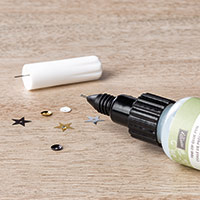
  10. Finally, to make the frog stand out even more, I tested the theory that the Fine Tip Glue Pen can be used as a substitute for Crystal Effects (which we no longer carry). It worked! It takes a little longer to dry but has very similar results. 
SaveSave

Wednesday, 6 July 2016

Timeless Textures with Pop of Paradise


What kind of fevered mind put this colour combination together? It’s from the mind of one of my downlines and crafty friends, Patsy, who dragged me out of my comfort zone recently to create this card. I actually really like it – who would have thought I’d say that about purple, pink, red, orange and green together? It’s like a bag of Skittles!


The greeting was supposed to be stamped in the middle, but I didn’t leave enough room, so a Pop of Paradise banner came to the rescue.

The small print

This is my personal blog and my sole responsibility as an Independent Stampin' Up!® demonstrator. All images are © Stampin' Up!® All content including photographs, projects and text are © Helen Read, unless otherwise stated. Please feel free to copy my ideas for your personal use and inspiration - if you are a SU demonstrator you may use these ideas for your events but please give credit where it is due. Please do not use my ideas for monetary gain, competitions or publication. The images on this blog - including blog buttons - should not be copied and used elsewhere on the internet or on CDs.