Showing posts with label Enamel Shapes. Show all posts
Showing posts with label Enamel Shapes. Show all posts
Wednesday, 8 February 2017
Celebrations Duo embossing folder with Blooms & Wishes
I was delighted to see that some of my team members had promoted to Silver, so created these pretty cards - with a hint of silver glimmer paper - to mark the occasion. I used Blooms & Wishes combined with the fab new debossing folders, Celebrations Duo (p40, Spring/Summer catalogue). These are really fun as they work in the opposite way to our usual embossing folders, which allows you to stamp on top and around the image.
For the perfect sentiment, ”so proud of you”, I used Marquee Messages. Finally, a touch of bling!
And for one of my new recruits, a similar version using Color Enamel Shapes...
Friday, 16 September 2016
Sweet Sugarplum gift and card combo
Kelly’s card uses the same colours as her gift. I was aiming for clean and simple and started by stamping some Timeless Textures spatters in Tip Top Taupe. They weren’t doing it for me so I added some Sweet Sugarplum spritzing… and when you start spritzing with ink, anything can happen, as it did here. It’s hard to tell from the photo but I also spritzed some Dazzling Diamonds glimmer paper with Sweet Sugarplum ink to match the project.
Links by TheseAreMyStamps.com
Monday, 11 July 2016
Mix It Up Monday: Blooms and Wishes
This is quite an autumnal colour scheme for July, but it’s always good to plan ahead. I’m not normally a huge fan of orange but I do like it combined here with the sobering influences of Dapper Denim and Soft Suede. Yes it’s Mix It Up Monday again and time for another project made with a colour combination from my latest set of In Color charts.
I wanted to have another play with Blooms & Wishes and, while creating this card, I realised it would be perfect for one-sheet wonder projects, too. Here I’ve just stamped a quarter of a sheet of cardstock to create my busy background, then topped it with a simple greeting. Fun to do and, by ‘stamping off’ onto scrap paper first, you can get several shades from the same ink pad.
Links by TheseAreMyStamps.com
Wednesday, 6 July 2016
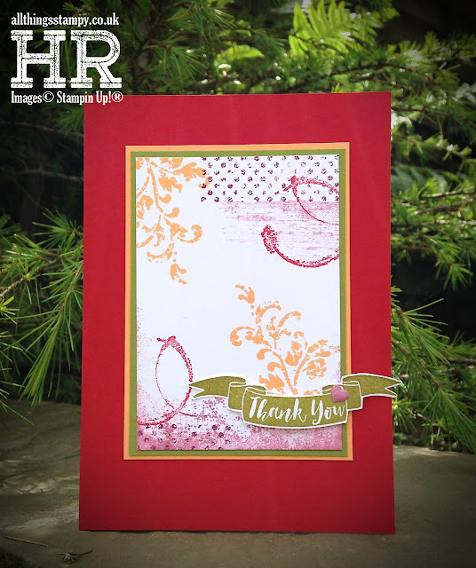
Timeless Textures with Pop of Paradise
What kind of fevered mind put this colour combination together? It’s from the mind of one of my downlines and crafty friends, Patsy, who dragged me out of my comfort zone recently to create this card. I actually really like it – who would have thought I’d say that about purple, pink, red, orange and green together? It’s like a bag of Skittles!
The greeting was supposed to be stamped in the middle, but I didn’t leave enough room, so a Pop of Paradise banner came to the rescue.
Links by TheseAreMyStamps.com
Subscribe to:
Posts (Atom)
The small print
This is my personal blog and my sole responsibility as an Independent Stampin' Up!® demonstrator. All images are © Stampin' Up!® All content including photographs, projects and text are © Helen Read, unless otherwise stated. Please feel free to copy my ideas for your personal use and inspiration - if you are a SU demonstrator you may use these ideas for your events but please give credit where it is due. Please do not use my ideas for monetary gain, competitions or publication. The images on this blog - including blog buttons - should not be copied and used elsewhere on the internet or on CDs.


