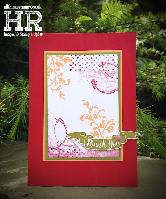
Timeless Textures with Pop of Paradise
What kind of fevered mind put this colour combination together? It’s from the mind of one of my downlines and crafty friends, Patsy, who dragged me out of my comfort zone recently to create this card. I actually really like it – who would have thought I’d say that about purple, pink, red, orange and green together? It’s like a bag of Skittles!
The greeting was supposed to be stamped in the middle, but I didn’t leave enough room, so a Pop of Paradise banner came to the rescue.
The small print
This is my personal blog and my sole responsibility as an Independent Stampin' Up!® demonstrator. All images are © Stampin' Up!® All content including photographs, projects and text are © Helen Read, unless otherwise stated. Please feel free to copy my ideas for your personal use and inspiration - if you are a SU demonstrator you may use these ideas for your events but please give credit where it is due. Please do not use my ideas for monetary gain, competitions or publication. The images on this blog - including blog buttons - should not be copied and used elsewhere on the internet or on CDs.


No comments:
Post a Comment
Thank you so much for taking the time to comment.