Sorry I can't update the blog right now. Please find me on Facebook

Monday, 11 July 2016

Mix It Up Monday: Blooms and Wishes


This is quite an autumnal colour scheme for July, but it’s always good to plan ahead. I’m not normally a huge fan of orange but I do like it combined here with the sobering influences of Dapper Denim and Soft Suede. Yes it’s Mix It Up Monday again and time for another project made with a colour combination from my latest set of In Color charts. 


I wanted to have another play with Blooms & Wishes and, while creating this card, I realised it would be perfect for one-sheet wonder projects, too. Here I’ve just stamped a quarter of a sheet of cardstock to create my busy background, then topped it with a simple greeting. Fun to do and, by ‘stamping off’ onto scrap paper first, you can get several shades from the same ink pad.


Saturday, 9 July 2016

Around the World Blog Hop: CASE the catalogue!


It’s time for another Around the World Blog Hop! Thank you so much for visiting today and I’m delighted you could join me on this trip around the world, as we CASE the catalogue. You may have joined me from Julie’s blog, or may have happened upon this post by chance. Either way, please continue on to Anke’s blog afterwards and follow the trail to see the rest of the creations. 


First things first, what exactly is CASEing? It stands for Copy And Share Everything and it’s what we stampers do when we’re short of time, short of ideas or simply see something we love so much we have to make one for ourselves. 

Secondly, there is absolutely no shame in CASEing. I’m firmly of the view that, if you don’t want people to copy your projects, don’t put them on the internet! However, it is polite to give credit where it’s due, which is why I always try to link back to the person who inspired me. 

And thirdly, CASEing doesn’t have to be an exact copy. You can copy a colour scheme, a layout, or simply a cool technique. Here I’ve stayed pretty close to the original project (below), which features on page 133 of the current catalogue. When I first flicked through the catalogue, this project was one of the first to shout out at me, even though it uses a stamp set that’s at least a couple of years old. 

Stampin’ Up!®
I absolutely loved the watercolouring technique on the card, and the fact that non-traditional colours were used. The splattering of ink appealed to me, too, and I soon discovered it’s really easy to achieve simply by tapping your paint brush. 

Finally, here’s the full list of participating bloggers, so that you don’t miss a single post! Thanks again for visiting and hope to see you again soon!

Miriam van Eyden (Netherlands)

Barbara Meyer (Austria)

Martha Lucia Gomez (USA)

Julie Davison (USA)

Helen Read (UK)

Anke Hämsch (Germany)

Kristine McNickle (New Zealand)

Alisa Tilsner (Australia)


Caturday: Kitty


Cats are very frustrating to photograph... unless they’re asleep. They either turn away haughtily, walk off snootily or do this: come up to sniff the camera so they’re too close and out of focus. Thanks, Kitty! Unfortunately I was in too much of a hurry to have another go!

I’ll be back later with another blog post as it’s time for another Around the World Blog Hop. Come back at 9pm BST to see my take on the theme: CASE the Catalogue!

Thursday, 7 July 2016

Love You Lots with Pop of Paradise and a splashy watercolour technique


It’s that frog again (I don’t even like frogs!) from Love You Lots, the gorgeous new hostess stamp set. 
This is the result of some experimentation at June’s Crafty Friday event, where we played with watercolour techniques again. Here’s how to recreate this technique:

  1. Begin by stamping an outline image (ie, one you can colour in) twice in permanent ink; once on the watercolour paper and once on some thin scrap paper or sticky note. 
  2. Cut out the image from the scrap paper to create a mask.
  3. If using scrap paper, apply a temporary adhesive (Tombow is temporary if you allow it to dry thoroughly) on the back of the mask. 
  4. An alternative method would be to skip the mask and use masking fluid (available from art shop) all over the image on the watercolour paper. It can be rubbed off when the project is complete. 
  5. With your main image safely covered, now you can create the splashy background. Simply pick up ink with a paintbrush or aquapainter and tap the top of the brush.
  6. A wetter brush will result in larger, paler splashes.
  7. More concentrated ink, ie less water, will result in smaller, darker splashes. 
  8. When you’re happy with the results, allow it to dry thoroughly, then remove the mask. If you’ve gone a bit mad with the splashing (easy done) you may find some of the colour has seeped through, but you can remove this to a certain extent with a paintbrush and clear water. 
  9. Now you can paint your main image as desired. I soon realised that my frog couldn’t be green as he wouldn’t stand out, so went for So Saffron. Yes, this is So Saffron, you wouldn’t think it, would you? But when you use the ink in its concentrated form, with just a little water, it leans more towards Delightful Dijon. 
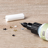
  10. Finally, to make the frog stand out even more, I tested the theory that the Fine Tip Glue Pen can be used as a substitute for Crystal Effects (which we no longer carry). It worked! It takes a little longer to dry but has very similar results. 
SaveSave

Wednesday, 6 July 2016

Timeless Textures with Pop of Paradise


What kind of fevered mind put this colour combination together? It’s from the mind of one of my downlines and crafty friends, Patsy, who dragged me out of my comfort zone recently to create this card. I actually really like it – who would have thought I’d say that about purple, pink, red, orange and green together? It’s like a bag of Skittles!


The greeting was supposed to be stamped in the middle, but I didn’t leave enough room, so a Pop of Paradise banner came to the rescue.

The small print

This is my personal blog and my sole responsibility as an Independent Stampin' Up!® demonstrator. All images are © Stampin' Up!® All content including photographs, projects and text are © Helen Read, unless otherwise stated. Please feel free to copy my ideas for your personal use and inspiration - if you are a SU demonstrator you may use these ideas for your events but please give credit where it is due. Please do not use my ideas for monetary gain, competitions or publication. The images on this blog - including blog buttons - should not be copied and used elsewhere on the internet or on CDs.