It’s Monday! And let’s start the week with a look ahead to autumn, one of my favourite times of year.
Summer isn’t really my thing; I burn to a crisp in minutes and the heat just drags me down. Thankfully, not a major problem in the UK, although sadly becoming more of one. As the days shorten, I miss the long, light evenings, but I welcome the cooler weather and beautiful colours that autumn brings.
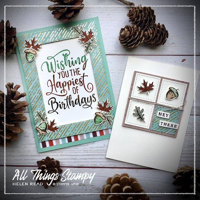
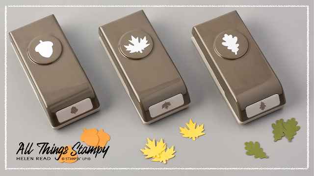
It is no surprise, therefore, that the first products I bought from the new August-December Mini Catalogue was the whole of the Gilded Autumn Suite. I haven’t used every part of the Suite yet but I have been enjoying the Beautiful Autumn stamp set, the Autumn Punch Pack and the stunning Gilded Autumn Specialty Designer Series Paper which has beautiful copper and gold foil on some designs, such as the one you see here.
I have to say, the stamps line up beautifully. They are photopolymer, which helps, and lining up the leaf and acorn centres with the outlines is really easy, although they look good offset, too, if there’s enough of a colour contrast.
For this card, I used one of my favourite Annual Catalogue stamp sets, Happiest of Birthdays. This is SUCH a great stamp set and ideal for masculine and teen cards as the greeting does all the heavy lifting for you.
Yes, this is a product-heavy card; on top of all the Gilded Autumn goodies and the Happiest of Birthdays stamp set, it uses the Stitched Rectangles Dies to create a DSP frame around the words. I’ve embellished the frame using those beautiful stamped and punched leaves and acorns.
When it came to the second card, I had a bit of a wobble about my acorns, and decided the colours should be the other way round. Green cap, brown acorn. Then I checked with my husband, a keen naturalist (I said naturalist!!!!) and he confirmed that either is fine as they change colour over the course of the season.
This little Very Vanilla Notecard used up some leftover punched pieces and DSP, and the Stitched Shapes Dies. It’s always great to be able to product a second card from the bits left on your craft table, isn’t it?
I love the colours, the crispness and the images... yes I know I shouldn’t say so myself but why not? I made a card and I love it. If you receive this – or indeed the first card – in the post, you know you’re pretty high up in my estimation!
To get the three-colour greeting, I used the Stamparatus. Always start with the palest colour... inking the top of the stamp using your ink pad or sponges, or even a brayer if that’s easier.
Stamp it using the Stamparatus and then, without moving the cardstock (held down with the magnet), ink up with the next colour. It can be difficult to do this using an ink pad, and can give you a harsh line, which is where the sponges, sponge daubers or brayer come in handy. Even if you manage it with an ink pad, the sponge can soften the line. Stamp and repeat with the darkest colour at the bottom.
Using the Stamparatus allows you to avoid any gaps and go back and add more colour where required.


No comments:
Post a Comment
Thank you so much for taking the time to comment.