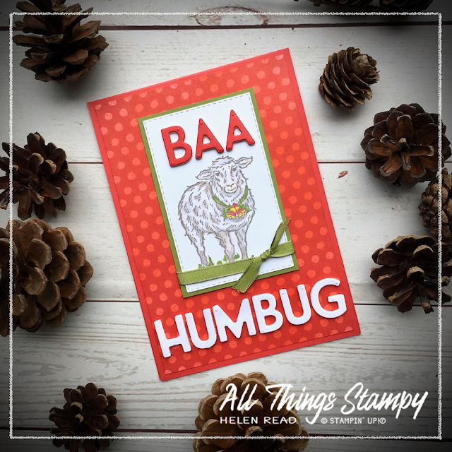
I’ll be honest, I’m not really ready for Christmas cards... although you may have gathered that from the sentiment on this card...
But it was a fun opportunity to use three new Stampin’ Up!® products; the fabulous Yuletide Pasture stamp set and some lovely polka dot paper from the Trimming The Town Suite from the new August-December Mini Catalogue and, from the still newish Annual Catalogue, the must-have Playful Alphabet Dies.
I began by stamping the Yuletide Pasture sheep in Gray Granite, then gently colouring her in using Stampin' Blends alcohol markers. It can be challenging to achieve subtle colours using Stampin’ Blends so I did this by using Smoky Slate Light with Ivory on top, then toned it down with the Colour Lifter.
Just so you know, you can’t really use the Colour Lifter as a blender pen because it simply doesn’t work that way. It’s a bit of a misnomer actually because the Colour Lifter doesn’t lift; rather it pushes some of the ink through to the back of the cardstock.
Just so you know, you can’t really use the Colour Lifter as a blender pen because it simply doesn’t work that way. It’s a bit of a misnomer actually because the Colour Lifter doesn’t lift; rather it pushes some of the ink through to the back of the cardstock.
Image coloured, cut out using Stitched Rectangle Dies and mounted on some Old Olive cardstock, it was time to create my sentiment – and this was something I’d had in mind from the moment I saw this stamp set.
Out came the Playful Alphabet Dies and a brand new adhesive to go with them. I have only just purchased the Foam Adhesive Sheets but they really are a game-changer. Stick your cardstock to a sheet (or piece of sheet) and die-cut it all together. It’s an absolute boon with small dies such as these as you get a perfectly cut Dimensional to make it really easy to stick your letters down.
So there we have it. I bought the Yuletide Pasture stamp set with this card in mind and now just need to come up with some other ideas for the rest of the images. Actually, I already have done ... and you can see the Highland Cow in action on Thursday when I take part in another blog hop. Please come back to see the cow like you’ve never seen it before – and are never likely to see again!
Designer Series Paper only ‘almost’ perfect for your project? This is the issue I had here. I loved the polka dot paper from the Trimming the Town Designer Series Paper pack but I found the white letters didn’t stand out quite as clearly as I’d like against the white. To keep the pattern without the contrast, I simply brayered over the top using Poppy Parade ink.
No brayer? No problem, just use a sponge instead. No sponge either? Try the direct-to-paper technique, swiping your ink pad over the paper... just be aware that this will give you a much more intense effect, as long as your ink pad is well inked.
No brayer? No problem, just use a sponge instead. No sponge either? Try the direct-to-paper technique, swiping your ink pad over the paper... just be aware that this will give you a much more intense effect, as long as your ink pad is well inked.


No comments:
Post a Comment
Thank you so much for taking the time to comment.