It’s that time of year again... time for my much-anticipated Stampin’ Up!® colour combinations.
This time it has been a mammoth task creating colour combinations not just for the new 2023-25 Stampin’ Up!® In Colors™ but the four new core colours and seven returning core colours. That’s 16 new and returning colours in total, with 10 colour combinations for each, so a whopping 160 new colour combinations.
Even more if you try a sneaky trick I noticed... some of the charts feature fun five-colour combinations if you read down the columns instead of along the lines. Bonus!
Don’t try to take the combos from this page as right-click won’t work. Instead you can download a printable version from my website here. It's an A4 document but will print just as well on US-sized paper if you click "fit to page" on your print settings.
DOWNLOAD MY 2023 COLOUR COMBOS
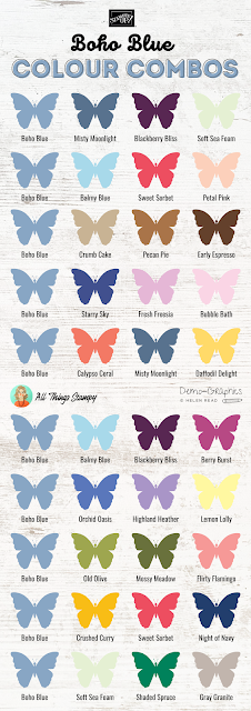
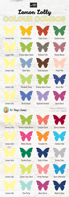
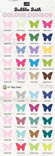
Here are the Stampin’ Up!® colour combos... the pictures aren’t huge as I don’t want to make the longest post in the world. Remember you can download a printable version.
I LOVE Copper Clay! It’s so warm and comforting. It goes brilliantly with blues, as well as with natural greens and rich shades such as Pretty Peacock and Cajun Craze.
Wild Wheat has had a lot of bad press from people comparing it to baby poo! But I think it’s unfair as this is a gorgeous deep mustard colour, perfect for those of us who still lament the loss of that old Stampin’ Up!® In Color™ from 2015-17; Delightful Dijon.
Even those who don’t love our lovely new dirty Stampin’ Up!® In Colors™ love Boho Blue. It’s soft and gentle and looks great not just with its fellow In Colors but with soft oranges/reds such as Calypso Coral and Sweet Sorbet. Pair it with Highland Heather for a really pretty spring flower vibe.
Reminiscent of the retired colour Sweet Sugarplum, Moody Mauve (pronounced to rhyme with cove) is a gorgeously dusky colour which sits equally well with pinks as it does with greens. Look how fab it looks next to Pretty Peacock, too!
I’ve never been one to get excited by grey but Pebbled Path has brown tones which make it more than acceptable in my eyes. It’s a great neutral colour which will go with pretty much all the colours in your Stampin’ Up!® collection.
Hurray for the return of Misty Moonlight, one of my favourite Stampin’ Up!® blues ever. This soft denim shade is so versatile, creating this colour chart was easy. Although I should confess that for the returning colours I have reused/updated some combos from when the colours was initially launched. Some I change because the colours had retired; some simply because I had a better idea with new colours at my disposal. Look at that bottom row – love it!
The brand new core Stampin’ Up!® colour Pecan Pie is quite similar to the In Color™ Copper Clay but there are key differences. Copper Clay is a much warmer colour, whereas Pecan Pie is more neutral. And don’t forget Copper Clay is only around for two years, while Pecan Pie is a core colour so we have it at least until the next colour refresh in around five years’ time.
I loved Lemon Lime Twist when it was first launched as a Stampin’ Up!® In Color™ in 2017 and I still love it now. We really need those really bright shades sometimes, and it looks amazing when used to pack a punch against Blackberry Bliss.
Azure Afternoon, a brand new Stampin’ Up!® core colour, is here to replace the now-retired Pacific Point. I’m not a turquoise fan but I can cope with this as it’s on the warm side, and looks great with Poppy Parade and Night of Navy for a nautical look.
I remember loving Berry Burst when it was launched as a Stampin’ Up!® In Color™ in 2017 but I’m struggling to get excited about it six years later. However, with the loss of Rich Razzleberry, I know I will learn to love it all over again.
Now I LOVE yellow more than most people but I am really struggling with Lemon Lolly. I am going to have to work really hard to use this in my projects as I find it a little too acidic. Yes I know, I love Lemon Lime Twist which is also acidic. What can I say? I’m a complex person. This chart therefore was HARD to make so I hope it lives up to expectations.
I’m delighted to welcome Lost Lagoon back into the Stampin’ Up!® fold. Launch in 2014 and retired in 2016, I never thought we’d see it again! Timing is everything as it goes SO well with all of our new In Colors™ – they are made for each other.
Fresh Freesia is a bit of a fraud here, as it’s billed as a returning Stampin’ Up!® colour but never really went away. Basically it retired at midnight and returned at 12.01am as a new core colour. I’m not complaining, you understand, because I love it and was really sad to think it was leaving. It’s perfect with all our purples, blues and greens.
I wasn’t too excited about Bubble Bath when I first saw it in isolation. But next to Fresh Freesia on the Stampin’ Up!® colour chart it looks gorgeous. It’s a brighter, pinker pink than the outgoing Blushing Bride, and sits beautifully in our newly refreshed Subtles collection. I love it with the toothpaste shade of Coastal Cabana. And I NEVER use Coastal Cabana, so that’s a new feeling for me.
Everyone loved Pretty Peacock when it joined the Stampin’ Up!® collection in 2019 and was sad to see it go in 2021. While Pretty Peacock (2019-21) and Lost Lagoon (2014-16) had never previously met, I am so glad they are both returning as they are PERFECT together.
Blueberry Bushel was another favourite blue of mine, and I was sad to see it retire in 2020, although frankly in spring 2020 I think we all had other things on our minds. The only colour from the 2018-20 Stampin’ Up!® In Colors™ to return, unfortunately, as I had high hopes for Lovely Lipstick replacing Melon Mambo, but it wasn’t to be.
You can download a printable version of all 160 combos here
So that’s all of my 2023 colour combos. What’s next?
There are a few things you might wish to know. One is that I offer a graphics service for demonstrators and have beautiful image posts for your social media featuring some of these colour combos. These are available in sets of 10 from my graphics store and can be personalised with your logo.
Find out more about my graphics service here
The second thing is that I would love you to Pin these images to Pinterest but if you do, please ensure you tap/click the post title first. If you don’t do that, the Pin will just bring people to the main page of the blog, which is no help in a few months’ time. It’s frustrating when people just Pin from the main page as the post could be several years old and almost impossible to find again.
The third thing is that although I hate to bring this up as I am not good at pushing the financial side of things, these combos took literally hours to create so if you would like to
I’d be really grateful. I’m currently looking for freelance work (writing, editing, designing, proofreading) as well as trying to promote my Stampin’ Up!® business so every little helps right now. Thank you!
Finally, if you’re not already a demonstrator and are in the UK or Ireland, does
your wish list come to more than £99? If so, please get in touch and I will
help you get more for your money and unlock discounts all year round.

.png)


No comments:
Post a Comment
Thank you so much for taking the time to comment.