Thursday, 30 June 2016

Pop of Paradise watercolour splash


I apologise for the slightly discordant colour combination of this project. Actually, I don’t, as that’s exactly the look I was going for.

It all started out very tastefully; I was CASEing a wonderful project I’d seen by UK demonstrator Tracy May, which is subtle and classy and fun. But I got a bit carried away and it turned out like this. One of the problems with watercolouring techniques is that it’s so much fun, it’s hard to know when to stop.


So this is what I did:

  1. Ink up the flamingo in Melon Mambo, then ink up the legs and tip of the beak using Tempting Turquoise. I didn’t wipe off the Melon ink, just dabbed the Turquoise ink pad on top... hence the multi-coloured legs.
  2. Spritz the stamp with water and then stamp onto watercolour paper. 
  3. Before it dries, spritz the tail end only (I missed, evidently!) with water and watch the colours run.
  4. Then I just carried on playing by taking a paintbrush of ink and water and tapping it over the watercolour paper to create fun splashes. I used Tempting Turquoise, Melon Mambo and just a hint of Flirty Flamingo.
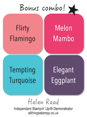
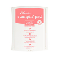
And this is where the clashing colours arose. Because I mistakenly believed that Flirty Flamingo was pink and would blend subtly with Melon Mambo. Turns out, when you dilute it, it goes a bit orangey, and clashes wonderfully. Well I like it. 

Wednesday, 29 June 2016

Best Birds workshop - just one place left


Just a quickie to say I have just ONE place left on this workshop, which will be a fun and relaxing event using the fabulous new Best Birds bundle. We’ll be covering a cute little birdhouse and more. Click the image or here to register but be quick - only ONE place left! (No exceptions, sorry, no room!)

Tuesday, 28 June 2016

Marquee Messages - It's Your Birthday


I had chance to play with the rather wonderful Marquee Messages at the weekend. I love the retro styling of this stamp set but wasn’t sure I’d make full use of all the words so have resisted getting it so far. Not sure I’ll be able to resist much longer as it’s a really fun set although, as I found, it does lean towards paper piecing… and I’m not a fan of fussy cutting. 

As my starting point, I Googled ‘retro Americana sign’ and came up with a fantastic array of signs which gave me the inspiration for the colour combination. Next I checked out what other people have been making with this stamp set and then CASEd the idea of the distressed brick wall from US demonstrator Amy Koenders.  To create this look, I inked up the raised sections of the embossing folder before adding the cardstock and running it through the Big Shot. This inked up the cracks in the wall (as well as a bit extra, giving it a nicely distressed look).

I coloured the lights and greeting using my chalk marker, added a little distressing using a Crumb Cake ink pad and then popped it all up on the wall. I do love it – and I kind of want to emboss the whole thing so it looks like metal. Maybe the next one…

Monday, 27 June 2016

Mix It Up Monday: Pop of Paradise


It’s Mix It Up Monday again and time for another project made with a colour combination from my latest set of In Color charts.

Today I thought I’d better grit my teeth and have a go with Flirty Flamingo. I confess this isn’t my favourite new In Color as I’m not a huge fan of pink. But for flamingoes, I admit that there’s no better shade! It’s pretty easy to colour the body and legs in different colours simply by careful positioning of the ink pads; start with the paler colour and then you won’t risk staining your pads. 


For the background, I spattered some paint around by loading up a brush and tapping it over my watercolour paper. This is a really fun technique and you can experiment to get different results. More water mixed with your ink colour will result in larger, paler splodges; less water and less liquid on your brush will result in smaller, darker splodges. 

I used Emerald Envy and Flirty Flamingo then, to get the paler green, because I don’t have a Mint Macaron ink refill, I simply used a wet paintbrush on the inside of the ink pad lid (remember to dry it afterwards, so you don’t dilute your pad!).


Saturday, 25 June 2016

Caturday - rat-urday


Have you ever seen a cat look so smug and proud? On Thursday evening, Pooboo performed a Victory March up the garden, calling out to all and sundry, before presenting us with this prize; a dead baby rat. He then sat beside it, posing for photos and basking in his glory while mistaking our screams of horror for adulation.

Friday, 24 June 2016

Blooms & Wishes with sweet Sweet Sugarplum


We in the UK have woken up to news that will either delight or devastate, depending on which way you voted in the European referendum. Whatever your thoughts on the outcome, the deed is now done. And while the future is uncertain, some things in life will not change. It will still rain on Bank Holidays (although the sun is shining for now), cats are still delightful (although come back tomorrow for a counter-argument) and stamping will still act as a great uniter of nations (no argument there).

So here’s some stamping to make your day brighter/even brighter* using a new stamp set, the name of which I cannot get to stick in my brain. Blooms & Wishes, that’s it. There are a few of these washy, painterly floral sets in the catalogue and it took me a while to choose between them. In the end I decided that this one would be the most useful to me and it turns out to be the most popular, among my stamping team at least. 


I absolutely loved the colour combination on the samples in the catalogue (page 139), which probably influenced my decision somewhat. As you’ve probably guessed, I have now come round to Sweet Sugarplum, which is my favourite of the new In Colors. I decided to emulate the catalogue colour combo here, with a slight change of green (SU used Mint Macaron) and addition of Crumb Cake to dirty it up a bit. Hope you like it!

*delete as applicable


Linen Thread
[104199]
£4.25

Thursday, 23 June 2016

Birthday Fiesta: more llama love


I promised you more llama projects so here’s another; something jolly to take our minds off the stresses and strains of the European referendum.

I never thought I’d warm to Emerald Envy as much as I have, but I keep finding myself turning to its bright jewel colour and it goes really well with Pêche Fraîche and Cherry Cobbler. Bonus combo there for you!


The small print

This is my personal blog and my sole responsibility as an Independent Stampin' Up!® demonstrator. All images are © Stampin' Up!® All content including photographs, projects and text are © Helen Read, unless otherwise stated. Please feel free to copy my ideas for your personal use and inspiration - if you are a SU demonstrator you may use these ideas for your events but please give credit where it is due. Please do not use my ideas for monetary gain, competitions or publication. The images on this blog - including blog buttons - should not be copied and used elsewhere on the internet or on CDs.