It’s time (finally!) for some sneak peeks of the new Stampin’ Up!® Annual Catalogue. Yes I know I’m a few weeks behind many other demonstrators but I’ve had very little crafting time lately.
Anyhoo... I really want to show you the FAB new In Colors™ so have made two sets of monochromatic cards to show them off, plus one card which brings four of the five colours together. Right at the bottom, I have created some colour comparison graphics to show how the new In Colors™look against Stampin’ Up!® colours past and present.
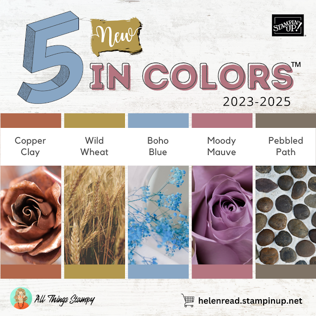
First of all let’s take a look at these gorgeous new Stampin’ Up!® In Colors™, which will remain current until 2025.
We have Copper Clay, Wild Wheat, Boho Blue, Moody Mauve and Pebbled Path. I haven’t been this excited about new Stampin’ Up!® colours for a long time because these are right up my street. I love a “dirty” colour and I love how these five work so well together. Yes, I hate grey and always have done, but Pebbled Path has a warmth to it that sends it nearer to brown. And yes Wild Wheat has been compared to baby poo but please don’t let that put you off. It’s a beautiful dark mustard colour that will bring depth to your Stampin’ Up!® projects.
Anyone can do pastels. Anyone can do brights. It’s time to embrace some mucky colours for 2023. As I predicted back in January, earthy tones are really on trend this year. In my first blog post of the year, I highlighted which of our beloved Stampin’ Up!® colours I believed would be hot in 2023 and it seems I was mostly correct.
The only ones that aren’t surviving the Colour Refresh are Soft Suede, which is being replaced with the warmer Pecan Pie, and Evening Evergreen. Although we get Pretty Peacock to slot in with the regal greens, I am still disappointed that Evening Evergreen isn’t coming back as a core colour!
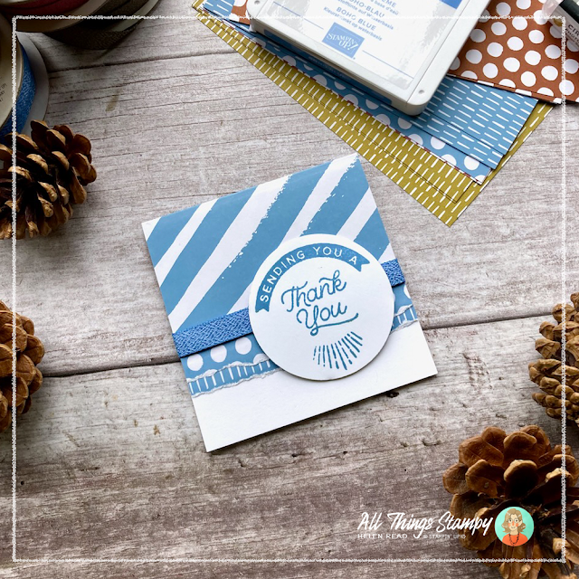
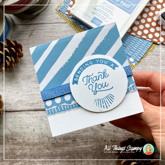
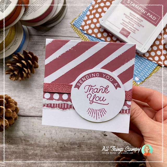
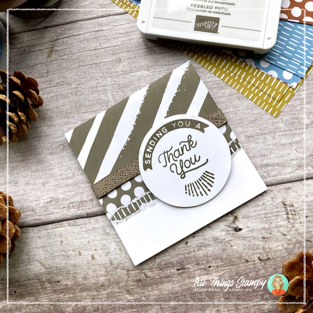
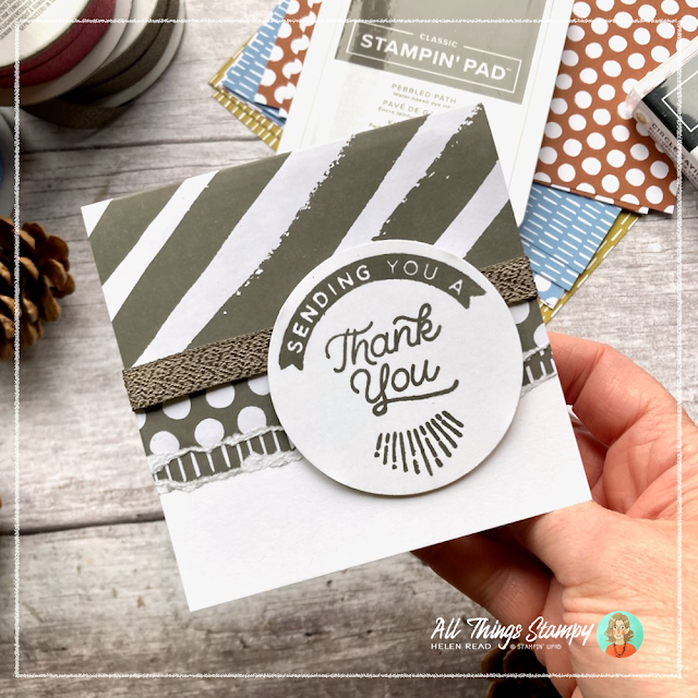
So onto some projects, starting with the little cards you see at the top of this post.
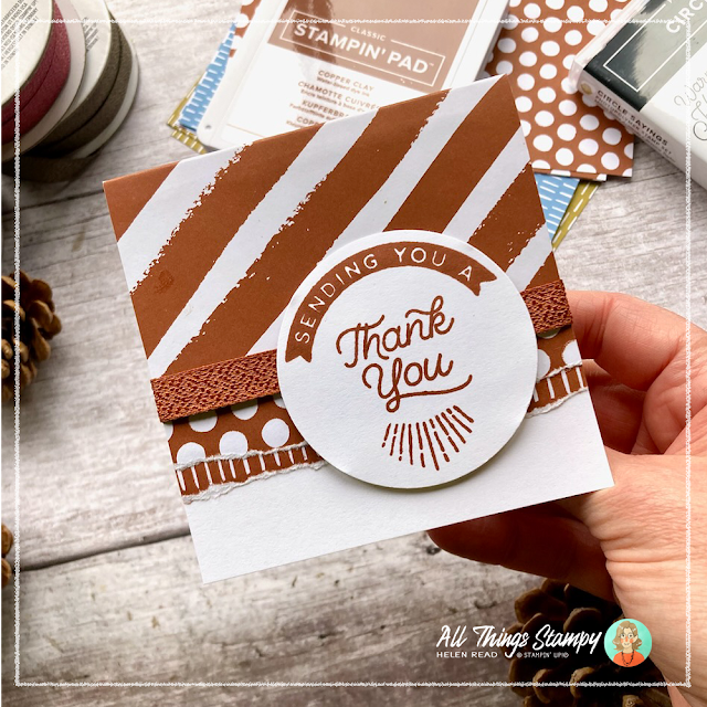
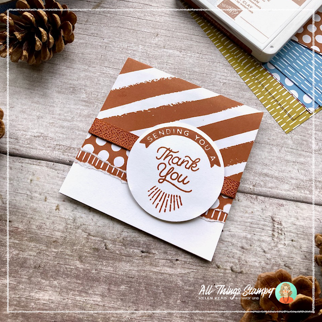
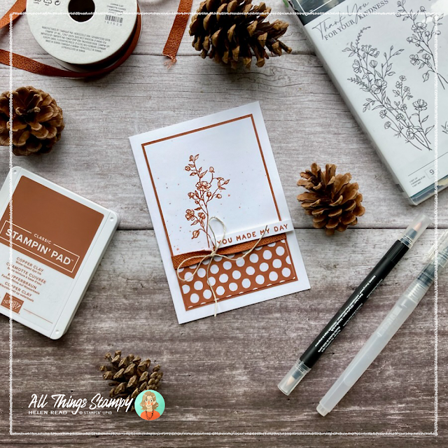
This is a card design I have been making for at least 15 years... because it works. Here’s one of many from 2008! When my mojo has gone walkabout, I often find revisiting an old design really helps, as it did here with this Copper Clay monochromatic card.
I don’t need envelopes for these cards so it doesn’t matter that they are a non-standard size. I began by cutting my A4 Thick Basic White cardstock down to 19.8cm wide, then scoring at 9.9cm along the length, before cutting it into three 9.9cm wide pieces to create three card bases with minimal waste. Well, no waste really as the long strip goes into the scraps box to be used for greeting labels on future projects.
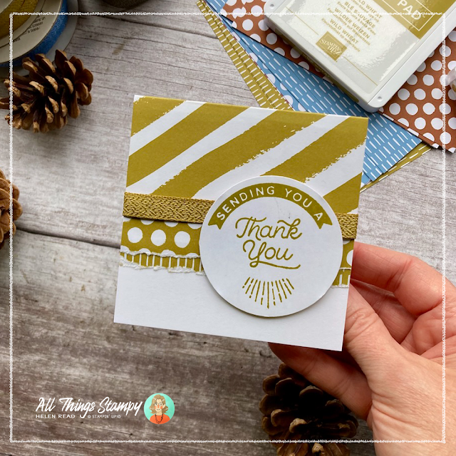
I cut the In Color™ Designer Series Paper with the thick diagonal stripes down to 9.9cm wide by about 10cm (it really doesn't matter) then trimmed off about 2.5cm to flip over to reveal the spotty side. See how the Wild Wheat is beautiful and doesn’t look at all like baby poo?
I used the large piece, stripes facing up, to cover the front of the card, folding about 2cm around the back for a nice neat edge.
With the spotty piece, and a 2cm x 9.9cm strip of the other patterned paper featuring lines, I tore the edge carefully then layered them up. The straight-edged join is covered with a piece of matching ribbon in beautiful Boho Blue. This is the least controversial of the new In Colors™ and I predict it will be extremely popular.
On top of this I used the new Circle Sayings stamp set, which will be available to customers on 2nd May, to stamp this useful greeting. This is three separate stamps and if you’re careful, you can fit them all onto one clear block and stamp them in one go, as I have done here in Moody Mauve. Nothing controversial about this colour... other than how to pronounce it. Here in the UK, we say “mauve” to rhyme with “cove”.
I cut the stamped images out with the new 2 3/8" circle punch – another sneak peek and a fabulous addition to the Stampin’ Up!® punch collection.
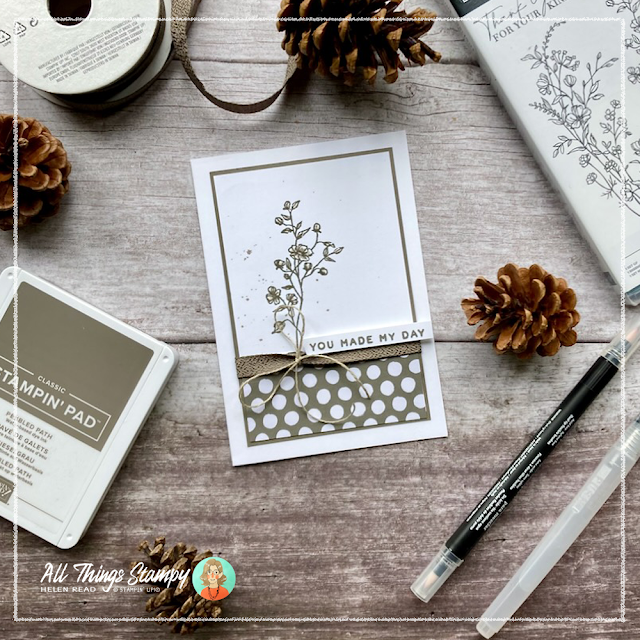
The last of the five cards is in Pebbled Path, which will take me longer to love but as long as I keep telling myself it’s nearer to brown than grey, I’ll get there quicker.
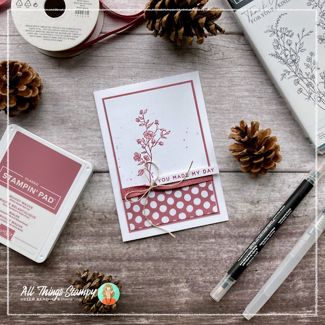
My second batch of monochromatic cards with new Stampin’ Up!® In Colors™ uses the Dainty Delight stamp set, which is carrying over into the 2023 Annual Catalogue. Here’s my first one in rich Copper Clay.
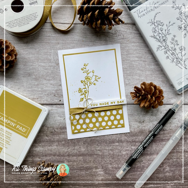
Each card uses a small piece of In Color™ Designer Series Paper – in this case, Wild Wheat – laid onto a panel of white stamped in each In Color™ then coloured in using just a Blender Pen to add shades of the same colour.
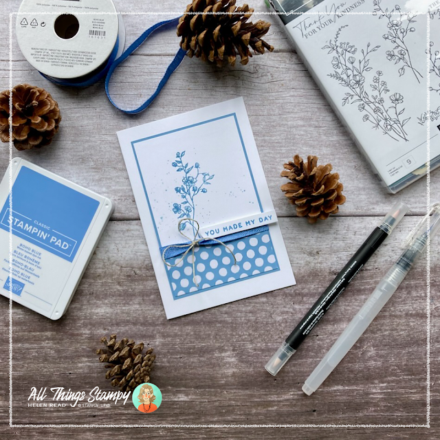
The one you’ve been waiting for? Boho Blue!
To add interest, I used a Stampin’ Up!® Water Painter with ink from the ink pad lid (you can transfer the ink to a clear block if you prefer to keep your ink pad lids clean) to spatter the ink across.
This is a really economical way to use your new ribbon, which saves money and bulk. I simply added an 11cm strip of Moody Mauve ribbon across the front layer, securing at the back with two pieces of tape. Instead of a ribbon bow, which is bulky and uses a lot of ribbon, I tied a piece of Linen Thread around instead. It goes beautifully with these lovely earthy shades.
Finally, I added a greeting from my otherwise as yet uninked new Stampin’ Up!® stamp set, Cheerful Daisies.
One more project... this time using four of the new In Colors™ all together, with that fab new stamp set, Circle Sayings. This was heavily inspired by a project in the new Stampin’ Up!® catalogue. It was a gift tag on a box but I’ve turned it into a thank you card using a tag made from new In Color™ Designer Series Paper in Pebbled Path, decorated with flowers stamped in Moody Mauve. I used my new Cheerful Daisies dies to create some spiky leaves in Wild Wheat.
Again, I have been really economical with my new ribbon; a simple loop of Boho Blue is tied up with a Linen Thread bow.
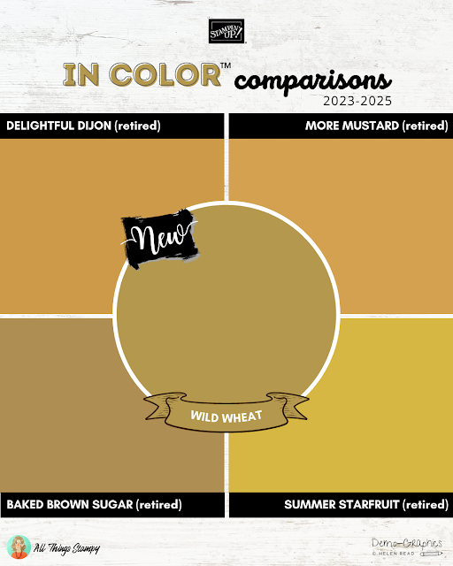
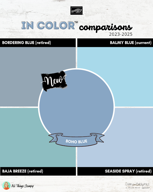
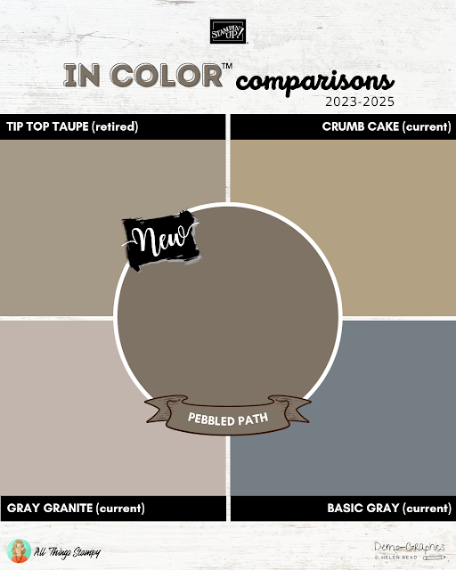
I hope you love the new In Colors™as much as I do. Before I go, here are some In Color™ comparisons with other Stampin’ Up!® colours past and present.
As you can see, Copper Clay is a little like Cinnamon Cider, just darker and richer. It’s warmer than the new colour Pecan Pie.
Wild Wheat is a welcome return of the dirty yellow, a sort of cross between Delightful Dijon and Baked Brown Sugar.
Boho Blue blends beautifully with Balmy Blue. It’s cleaner and sharper than the old Bordering Blue.
Moody Mauve reminds me a lot of Sweet Sugarplum, just darker and dirtier (yay!).
This is where Pebbled Path really shows its brown notes. It’s like the father of Tip Top Taupe, a colour I loved, so I can forgive it for looking a little grey. As you can see, next to Basic Gray, it’s not grey at all.
One more thing about comparisons... if you’re reading this and want to say “I’d love to see XXX next to YYY” (as those folk on social media liked to comment) please know that I have checked all the colours next to other Stampin’ Up!® shades and if I haven’t shown a comparison here it’s because it was nothing like it so no comparison was required. Sorry, bit grumpy there but when you’ve spend literally HOURS on carrying out research and creating graphics, you don’t really want to hear from someone who thinks you’ve not done it properly.
Anyway on a less grumpy note, look out soon for my much-anticipated colour combination ideas for all the new Stampin’ Up!® In Colors™ as well as the new and returning core colours. This will be a fabulous resource for all crafters.
Does
your wish list come to more than £99? Please get in touch and I will
help you get more for your money and unlock discounts all year round.








No comments:
Post a Comment
Thank you so much for taking the time to comment.