Do you love colour but struggle to put them together for your craft projects? Or may you are simply looking for some new ways to combine your favourite Stampin’ Up!® colours?
Help is at hand! Today I have some great colour ideas for you, including 30 new colour combinations for the five new Stampin’ Up!® In Colors™.
PLUS you can purchase an eBook of colour inspiration giving you enough Stampin’ Up!® colour combinations to use a different one each day for nearly 18 months!
Get the eBook here
Tips for putting Stampin’ Up!® colours together:Keep it simple and stick to one colour collection. That could be Brights, Regals, Subtles or Neutrals, or one of the In Color™ collections. The colours in each collection are designed to work well together.
Base your colour combination on a pack of Stampin’ Up!® Designer Series Paper. This could be a pack you own, in which case you are already flying and can use the paper in your project. But don’t just stick to the ones you own; take a look online and in the catalogues for Designer Series Paper packs. If you love the colours, read the product description to find out what they are. You already know these colours will work well together.
Want to get technical? Purchase the Color Coach™ and start putting actual science into practice. This handy tool shows you how to put monochromatic, complementary, analogous, and triadic colour combinations together.
Prefer to keep things more instinctive? Look around you and you will find colour inspiration everywhere. A dress, a pair of curtains, a tablecloth, a napkin, some wrapping paper, a cute notebook. Most Stampin’ Up!® fans will instinctively translate any colours they see into Stampin’ Up!® shades.
Check out my new eBook of 525 colour combinations, using all the new In Colors™, the 2024-26 In Colors™ and all 40 Core Colours.
2025-27 In Color™ combinations
The five new Stampin’ Up!® In Colors™ are Strawberry Slush, Timid Tiger, Darling Duckling, Cloud Cover and Secret Sea.
Here are just a few of the colour combinations you can expect to find among my eBook pages. I have created 30 colour combinations for the new 2025-2027 In Colors™ which you can see here. There are seven more combos for each of these five new colours in the eBook.
Strawberry Slush is a returning In Color™. I think it was 10 years ago or more that we last had access to this soft red. Its soft nature means it goes just as well with Brights as with Subtles.
Timid Tiger is a softer orange than Pumpkin Pie but not quite as coral as Calypso Coral. It goes so well with a wide range of Stampin’ Up!® colours.
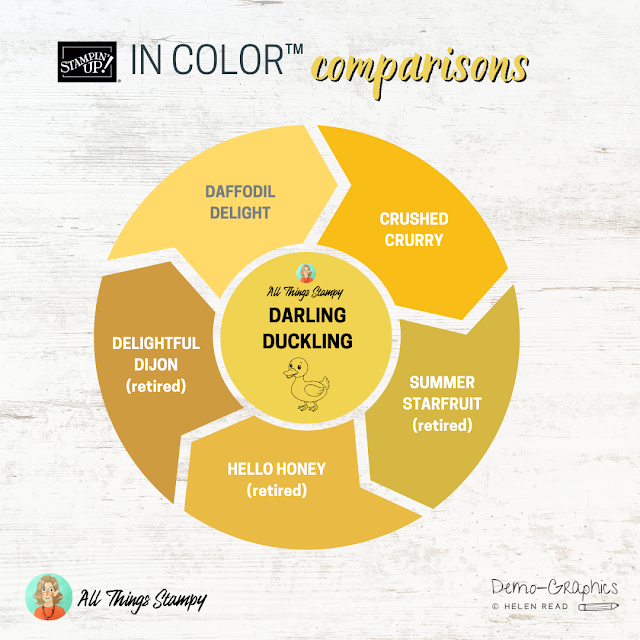
Darling Duckling is a yellow with a darker edge. Not quite as murky as the “dirty” yellows of the past, but with a bit more depth than Daffodil Delight.
Cloud Cover is gorgeous. It’s a lovely soft grey blue; a traditional heritage duck egg that will work really well as a blue and as a neutral. It goes particularly well with the final 2025-2027 In Color™, Secret Sea.
And here it is, Secret Sea, the final 2025-2027 In Color™ from Stampin’ Up!® Again, this works well as a blue and as a neutral. It is a really versatile colour. It can be a rich petrol blue, a charcoal grey, whatever you put it with, it will fit in well.
You will find all of these colour combinations and many more in my new eBook. There are 15 each in total for the new In Colors™, plus 10 colour combinations for each of the 2024-26 In Colors™ and all 40 Core Colours. That's a lot of combinations and a lot of work, which is why I have made this available to purchase here.
Buy the eBook here
Finally, do you want to see how the new In Colors™ look compared to similar past and present colours? Here are some handy graphics to help you.
As you can see, Strawberry Slush is softer than most reds, probably closest to the retired colour Watermelon Wonder. It will add colour without the kick of Poppy Parade. Definitely a good learner red if you love your pastels.
You can see here that Timid Tiger isn’t as harsh as Pumpkin Pie, or as pink as Calypso Coral. Definitely a great addition to the Stampin’ Up!® collection.
Darling Duckling has lots of depth without the intensity of Crushed Curry. You can see it really makes Daffodil Delight look almost pastel. I still miss Delightful Dijon though!
This is a great addition to the Stampin’ Up!® colour collection. Cloud Cover is the duck egg blue we all needed, bridging the gap between Pool Party and Smoky Slate. It’s going to get a lot of use in this house, I expect!
Finally, Secret Sea is a gorgeous rich colour. Is it blue? Is it petrol? Is it grey? I think it will be anything you want it to be!
I hope you enjoyed this exploration of the new colours.


No comments:
Post a Comment
Thank you so much for taking the time to comment.