As a Stampin’ Up!® demonstrator, I’m often told that card design is a
struggle and some people can only get results they are happy with by
copying. Well I’m here to help!
In today’s blog post – and on my Facebook and Instagram posts all week – I will be sharing foolproof tips for
designing cards, along with sketches, colour coordination and even a
little bit of maths.
One of the simplest and most common design principles is the Rule of Thirds, which is based on a grid of nine rectangles. You’ll most likely see this on your camera’s view finder to help you frame your photos.
The key points are the intersections – the points where the lines cross. Placing elements at one or more of these sweet spots will add interest to your design.
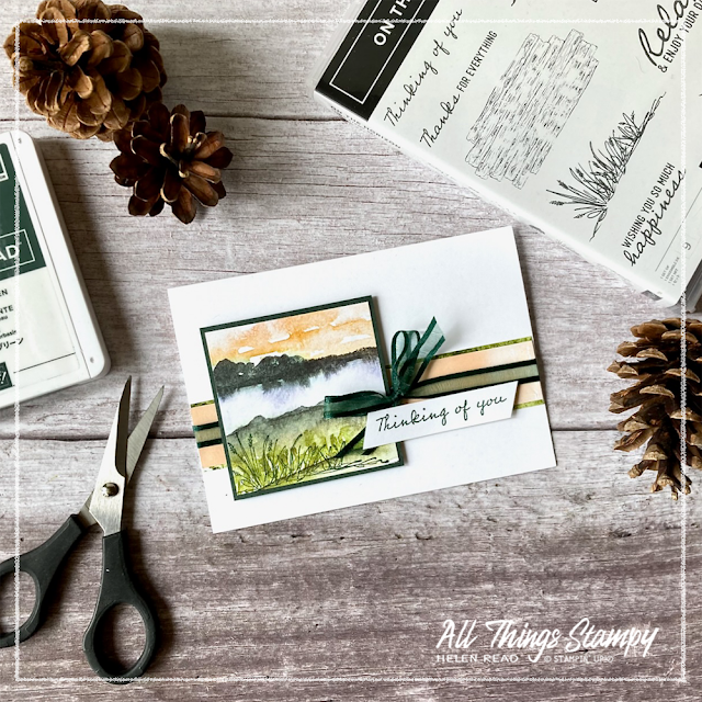
Here’s another card using the same sketch. This New Horizons Designer Series Paper is so gorgeous that you don’t need much stamping; I’ve just added a little bit of grass at the bottom left... pretty close to another sweet spot.
This is another example of the same sketch, this time using a Stitched So Sweetly die-cut rectangle (these dies are retiring soon; in fact I’m surprised they are still available!). This time the New Horizons Designer Series Paper provides the background and I’ve stamped trees in Fresh Freesia as the focal point.
Note that I have used three embellishments at the bottom right. Odd numbers are (nearly) always easier on the eye when designing anything, so I generally use three, five or – if I’m feeling extravagant! – seven embellishments to finish off my projects. These are in a row but if you’re going for that random scattered look, imagine an irregular triangle and position your elements at the points.
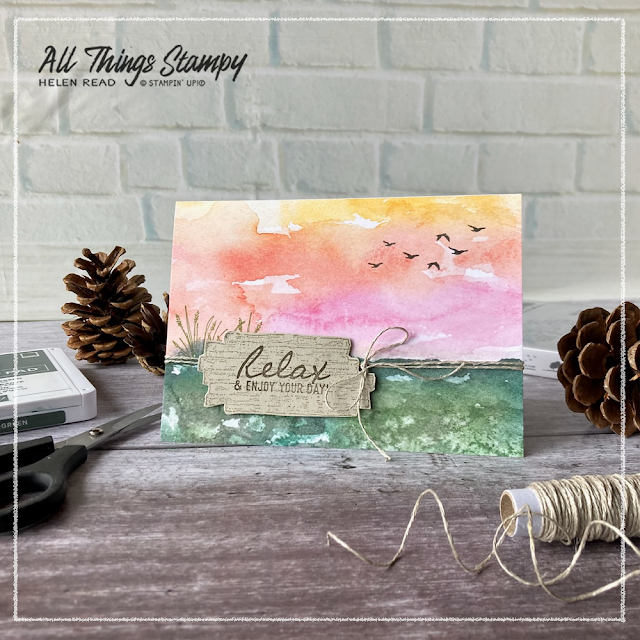
This is the same sketch again – oh yes it is! – just turned upside down. This time the main focal point is towards the bottom of the card, allowing space for birds in the sky. I’ve stamped the wooden sign in Crumb Cake ink onto Crumb Cake cardstock, stamped the words on top using Evening Evergreen and cut it out using my Stampin’ Snips.
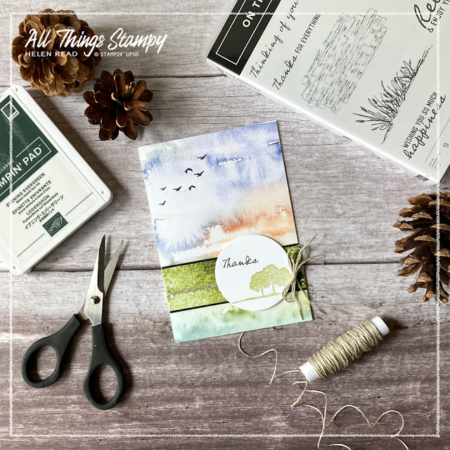
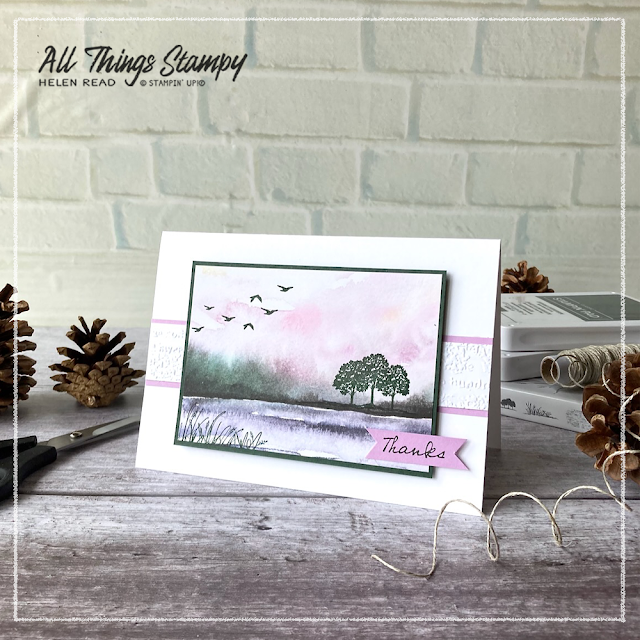
A similar idea is to offset the focal point so it sits firmly on one of the sweet spots, as I’ve done here with this Thanks card. The trees are positioned at the bottom right of the circle, and I’ve stamped birds in the sky at the top left. Think about diagonal opposites when positioning your elements as this will provide balance to your design.
Taking the same sketch and stretching it so the card is landscape, and flipping it so the element is on the left rather than the right, results in this card. Again I have balanced the design by stamping stamped birds diagonally opposite to the wooden sign and the stamped grasses.
This is another simple landscape card which turns the original sketch on its side. You can keep it simple like this or dress it up with more elements and embellishments. Just remember to aim for those sweet spots and keep your embellishments to an odd number.
The Rule of Thirds is a really simple design principle which is easy to follow. Apply it to your card making and scrapbooking and soon it will become instinctive.
However, don’t feel you have to stick rigidly to this because rules are made to be broken and if, for example, if you are making a square card, placing your design elements in the centre will work perfectly well. This is no accident as is probably because a square element will hit all four intersections!
Take a look at this landscape card; the sketch itself doesn’t really follow the Rule of Thirds. However, the stamping does. The birds hit one sweet spot, while the trees and greeting are clustered around another ... which just happens to be diagonally opposite. Even when you think you aren’t following rules, it often turns out that you are!
Meanwhile, if you are in the UK and would like to order, please
visit my store and, if you use the April 2022 host code YZH39MCB, I’ll send you a thank you gift in the following month.

.png)



No comments:
Post a Comment
Thank you so much for taking the time to comment.