Showing posts with label Color Combinations. Show all posts

Thursday, 1 May 2025

NEW In Color™ colour combinations and colour tips for your papercraft projects

 
Colour combo tips stampin cardmaking scrapbooking

Do you love colour but struggle to put them together for your craft projects? Or may you are simply looking for some new ways to combine your favourite Stampin’ Up!® colours?

Help is at hand! Today I have some great colour ideas for you, including 30 new colour combinations for the five new Stampin’ Up!® In Colors™. 

Tuesday, 29 October 2024

10 fabulous Stampin’ Up!® colour combinations for autumn

Stampin Up colour combinations for autumn

Do you struggle to put Stampin’ Up!® colours together? Do you wish you could find new and exciting colour combinations? I know some people don't feel confident putting different Stampin’ Up!® colours together, so as I’m having a week off from crafting, here are some tips – and 10 fabulous autumn colour combinations using your favourite Stampin’ Up!® colours. 

Tuesday, 20 February 2024

Four fab Stampin’ Up!® colour combinations for you to use

Stampin Up colour color combination combo
 

This is a bright fresh colour combination using Balmy Blue, Boho Blue, Sweet Sorbet and Petal Pink. Perfect for spring Stampin’ Up!® projects.

Tuesday, 17 October 2023

Fragrant Forest and Grassy Grove in a gorgeous autumnal colour combination

Stampin Up UK copper clay colour combo

 I have a colour combination for you today, and a card which blends the brand new Fragrant Forest background stamp with a Stampin’ Up!® old favourite, Grassy Grove.

Tuesday, 9 May 2023

Thursday, 29 April 2021

50 new Stampin’ Up!® In Color colour combinations


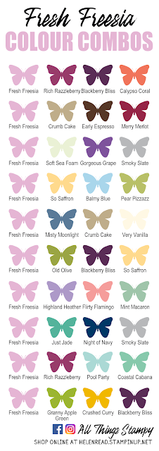
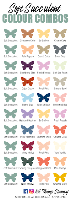
They’re here! By popular demand, I have created 50 new colour combinations using Stampin’ Up!®'s brand new 2021-23 In Colors™️. That’s 10 new combinations each for Soft Succulent, Evening Evergreen, Pale Papaya, Fresh Freesia and Polished Pink. These colours will remain current for two years, retiring in 2023.

On the whole I try to match the new colours with our existing colours, rather than within the new collection. This means you can match them with your current cardstock and ink pads, even if you only purchase one or two of the new colours. 
 
Please feel free to use these colour combinations in your projects; I would appreciate a link back to this page, or at least a credit.

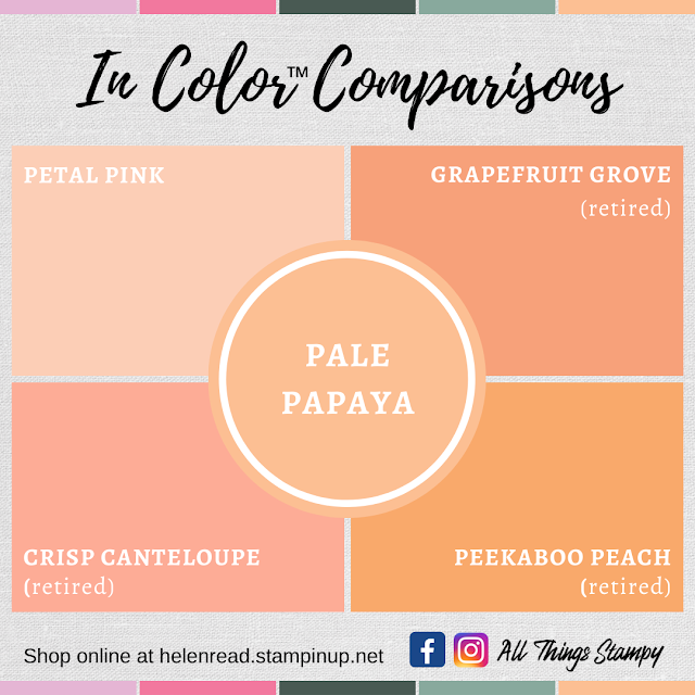
Scroll down past the colour combinations to see how the new colours compare to our existing and past shades. Often people will point out that a new colour is very similar to an old one; if this ever happens, I advise them that this is a fabulous opportunity to dig out their old ink pads and use them with the new cardstock, ribbon and embellishments. I cannot stand waste so, if you’re not a demonstrator, there’s absolutely no need to replace those old pads if they still have life in them. 

Want to get your hands on these colours? Please click here for my 2021 In Color Shares 

 Stampin Up In Colors 2021 colour combinations Evening Evergreen

Stampin Up In Colors 2021 colour combinations Fresh Freesia

Stampin Up In Colors 2021 colour combinations Pale Papaya

Stampin Up In Colors 2021 colour combinations Polished Pink

Stampin Up In Colors 2021 colour combinations Soft Succulent

Please click here to see colour combinations from previous years

Stampin Up In Colors 2021 colour comparisons Evening Evergreen

 
Stampin Up In Colors 2021 colour comparisons Pale Papaya

Stampin Up In Colors 2021 colour comparisons Polished Pink

Stampin Up In Colors 2021 colour comparisons Soft Succulent

Want to get your hands on these colours?
Please click here for my 2021 In Color Shares

Stampin Up In Colors Product Shares

Does your wish list come to more than £99? Please get in touch and I will help you get more for your money and unlock discounts all year round.  


Friday, 9 August 2019

Seaside Notions - and even simpler stamping


I do love this Seaside Notions stamp set, but then I’ve always been a sucker for a seaside theme. It’s perfect for creating a simple one-layer card like this. Just one pack of Notecards & Envelopes, one stamp set and four ink pads – done!

Use the “sand” stamp in this stamp set to create a lovely soft border around the bottom of the card. Just keep stamping without re-inking to get several shades of the same colour, then re-ink the stamp and repeat until you’re satisfied with the results. This is called “stamping off” and I’ve done the same with the weed stamp in Pool Party to get some paler weeds which don’t dominate the project. 

The addition of some Terracotta Tile sand in the bottom right corner provides balance to the seahorse, which is stamped in the same colour.

Wednesday, 7 August 2019

Seaside Notions and simple stamping


It’s Cuppa & Card today in Borrowash and this is one of the projects we’ll be making. It’s a very simple Seaside Notions project with some extra simple colouring. I love the colour combo of Pretty Peacock, Terracotta Tile, Pool Party and So Saffron – what do you think?


You can add depth to your colouring simply by doing what we always strive NOT to do: go over the edges! I’ve coloured these shells with blender pens combined with Terracotta Tile and Pool Party ink pads, deliberately adding a shadow all around the edge of each image in the same colour. I think it really adds depth to the images. 


Friday, 17 May 2019

2019-2010 Stampin’ Up!® In Color™ combinations are here!

New In Color™ combinations are here!

Please click the link to be taken to my Facebook post (you don’t need to be a member) to see this year’s colour charts. If you are a Facebook member, please like and share the post so that as many people as possible can enjoy the colour combinations. And if you enjoy the colour charts, please leave me a recommendation. Thank you!

In Color™ Comparisons

Lots of people ask how the new colours compare to existing and past colours, so I have made these comparison images to show you. The slightest change in shade can make all the difference to a project; for example, I think Calypso Coral is fresh and clean, but Terracotta Tile is a shade or two darker and would look more vintage. See what you think...


Friday, 31 August 2018

Sneak peek: Peaceful Noel


This stamp set from the upcoming Autumn/Winter catalogue is called Peaceful Noel but I think it's versatile enough to use for much more than Christmas projects. 

Here I've stamped in Lovely Lipstick to make an everyday card with a greeting from Love What You Do. Not sure I've quite pulled off the non-Christmas effect, but it was fun trying!


Monday, 27 August 2018

Botanica Bliss brayered card


I’ve rediscovered brayering since the arrival of the new sponge brayers, and used it to create a set of thank you cards to accompany this month’s orders.

I stamped using the Botanical Bliss stamp set, with its striking bird and delicate leaves, which stand out well against the brayered background.


I’ve used the Subtles Embossing Folder again - I just can’t get enough of it. It’s definitely a must-have product and I highly recommend it. It turns any piece of cardstock into textured cardstock for a really elegant look.

Monday, 20 August 2018

Sneak peek: Peaceful Noel


Fancy a sneak peek? This is a gorgeous new stamp set from the upcoming Autumn/Winter catalogue called Peaceful Noel. Yes, it’s a Christmas set, but I took one look at it and decided it could be so much more.

This is why I chose it for my upcoming All-Day Craftathon - everybody who attends will receive this set in their kit, and we’ll be using it during the day to make festive projects as well as non-Christmas projects such as this one.

Not everybody was impressed with my efforts though... Hamish just loves to photobomb when I’m trying to sort out my project images.


I love this colour combination, but I have to confess it’s the first outing for Pacific Point for absolutely ages. I don’t know why; it looks lovely with Mint Macaron here. Maye that’s why? Maybe I needed Mint Macaron and Mossy Meadow to come back (I’m so pleased they did).


Monday, 23 July 2018

Accented Blooms meets Pinewood Planks


Accented Blooms is one of those sets that illustrates what Stampin’ Up!® does so well - co-ordination. It goes with the Tailored Tag punch, which was launched in the spring along with a masculine set. Now the Tailored Tag punch is back for the new catalogue with a floral stamp set. I love the panel for the greeting and the big blowsy flowers.

I must admit I did think at first that this set might be a bit of a one-trick pony, but I intend to prove that theory incorrect.

For this project, I painted the image using ink pad lids and an old-fashioned paintbrush - you do have to work quickly when using Whisper White. Then I fussy-cut around the whole image - that was a decision I regretted before I was even a quarter of the way around - and mounted it onto some Whisper White cardstock embossed with one of my favourite folders; Pinewood Planks. Some of those fab new self-adhesives sequins finish it off nicely.


Thursday, 19 July 2018

Tropical Chic celebration card


I’m quite chuffed with how this card turned out, which is a relief as it’s for a very special occasion. It’s not every day that one of your team reaches such a major milestone as their 10th anniversary! Congratulations go to Kellie for sticking around – here’s to many more years!

To create the background I stamped repeatedly using Granny Apple Green, stamping over and over again without reinking to get various shades of green. I added some Petal Pink speckles to give a lift and to link to the die-cut Petal Pink flowers. These Basic Adhesive-Backed Sequins give it the perfect finishing touch. 


Monday, 16 July 2018

Tropical Chic week!


It’s time for another themed week, this time – in honour of our tropical weather – I am focussing on Tropical Chic.

This is a really fun and on-trend bundle of products. There’s a stamp set and dies, but you could easily work with one or the other. 


I had just the dies to work with for my OnStage display projects and had lots of fun. But the stamps went on my first catalogue order, to increase the project possibilities. 


This week I will be showcasing five projects using these products – but the possibilities don’t end there, far from it. My head is teeming with more ideas that I just haven’t had time to make just yet. I will be revisiting this bundle in the future, I promise. 


This project uses a totally tropical colour combo and involved splashing ink onto wet watercolour paper to create a pretty random effect. When it was dry, I cut it out using the square die you see in the photo above. And can you spot the Subtle Embossing Folder? It’s very well named but I promise you’ll love it. Lots of my customers have ordered this after seeing it on my sample projects – a photograph really can’t do it justice. Just trust me and buy it – you won’t regret it!


Friday, 13 July 2018

One simple kit: three different cards


A bit of a stamping mash-up today, from a play session using Love What You Do, the absolutely stunning Share What You Love Designer Series Paper and the Vertical Greetings stamp set.

These three cards just show how the same simple kit – Poppy Parade card blank, Whisper White layer and a strip of DSP – can make such a variety of projects. The only limit is your imagination!


Monday, 4 June 2018

Varied Vases - and a summery colour combination


How gorgeous is this colour combo? Three new colours mixed with Daffodil Delight give us a really summery look. I’ve decided I’m not going to commit to Mix It Up Monday this year, but will be bringing you colour combinations as and when I use them. You can still see all of my colour combinations on my Facebook page, here (you don’t have to be a member to view).

I’ve used Varied Vases, a brand new stamp set which handily has a co-ordinating punch, so you don’t have to fussy cut those vases. I did, however, fussy cut ALL of those yellow flowers... which are actually stamped in every shade of yellow possible. 

I confess, however, that I only went down that route because I messed up the stamping of the stem (should have used the Stamparatus!) so wanted to cover it up. There’s always a way!


The background is watercoloured using Balmy Blue, Highland Heather and Daffodil Delight. I painted one big piece then cut it in half to make the panels for these two cards; you can probably see where the Balmy Blue section originally joined.

Hope you like them! I confess I love them!


The small print

This is my personal blog and my sole responsibility as an Independent Stampin' Up!® demonstrator. All images are © Stampin' Up!® All content including photographs, projects and text are © Helen Read, unless otherwise stated. Please feel free to copy my ideas for your personal use and inspiration - if you are a SU demonstrator you may use these ideas for your events but please give credit where it is due. Please do not use my ideas for monetary gain, competitions or publication. The images on this blog - including blog buttons - should not be copied and used elsewhere on the internet or on CDs.