The month is nearly over and I haven’t shown you my June Mood Board project!
Each month I create a Mood Board to inspire my Stampin’ Up!® customers and team. The mood board can be used in various ways; as a colour challenge, as an inspiration challenge or as a bit of both. The main thing is that it kickstarts their creativity.
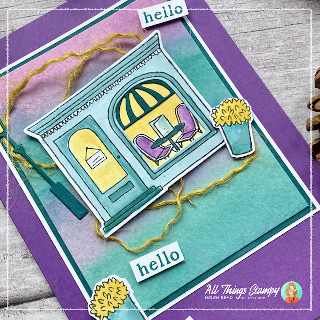
To create my project this month I used the fabulous Stampin’ Up!® stamp set Let’s Go Shopping. I love this versatile stamp set, with its small images to turn the shop into a bookshop, café or cake shop.
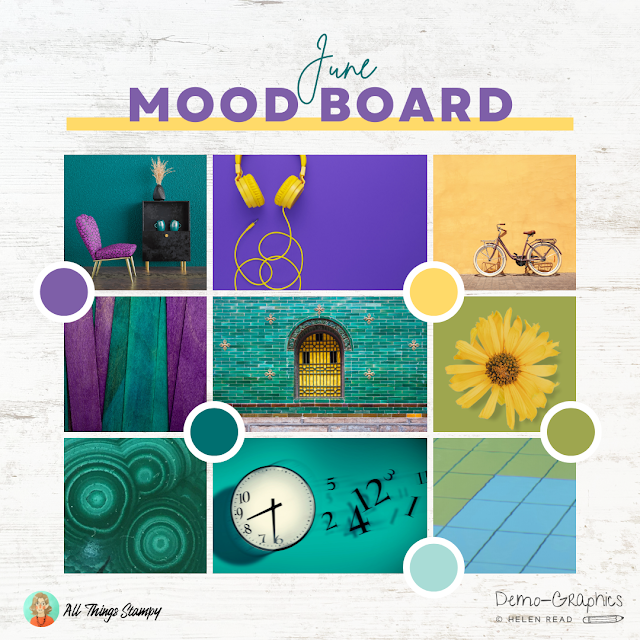
But before I go any further, let’s take a look at the June Mood Board to see where I found the inspiration for my Let’s Go Shopping card.
As you can see from the board, there are some rich Stampin’ Up!® colours available. These are Gorgeous Grape, Daffodil Delight, Pretty Peacock, Old Olive and Pool Party. But I always tell my customers and team to use these as a starting point; if they don’t have these colours they can simply use the nearest they have. For my card, I used all except Old Olive.
There are nine images on the mood board; these can be used for inspiration if you wish. I chose to take inspiration from several images for this Let’s Go Shopping project.
My starting point was the centre image of an ornate window against a brightly coloured tiled wall. I echoed this in the arched window of the café, with a Pretty Peacock die-cut from the Let’s Go Shopping die set to represent the ornate railings on the original photo. I used the same colours, too; Pretty Peacock for the building, and a glowing Daffodil Delight interior to mimic the yellow window on the Mood Board.
Inside the café was the perfect place to add some Gorgeous Grape chairs, inspired by the image at the top left of the mood board.
As I don’t currently have a brick wall embossing folder (which was my first thought to represent that beautiful tiled wall), I went down a different route for the background, taking inspiration from the centre left image of draped fabric in rich purple and teal.
I used watercolour paper for my background and swiped broad stripes across with a Stampin’ Up!® water painter and some Gorgeous Grape and Pretty Peacock ink. I pressed a clear block into my ink pads to create a palette for this.
I know Stampin’ Up!® ink pads are designed to be squeeze to create an ink palette in the lid but I know some people struggle with the squeezing (tip: turn the pad upside down), or don’t like the mess. In this case, I knew I may want to add more ink as I went along so didn’t want to have to keep drying my ink pad lid and starting over again.
Behind the café image on my card I have some swirled yellow twine, inspired by the image at top centre. Instead of curly wire, I have curly twine in Wild Wheat. This is from the Stampin’ Up!® In Color™ pack and I picked apart the three-ply jute trim to use just one strand, so it wasn’t so heavy.
You could say that I was inspired by the large yellow flower to add yellow flowers to the planters but I have only just thought of that! Maybe it was subconscious.
I was, however, inspired by the floating numbers in the bottom centre image and scattered my "hello" labels accordingly.
I had lots more ideas for projects from this mood board but ran out of time or didn’t have the products I wanted. I already mentioned that a brick wall embossing folder would have come in handy but if I’d had a Pretty Peacock ink refill I would have dropped some of this onto some wet watercolour paper to make some interesting swirls along the lines of the bottom left image. And if I’d been able to lay my hands on my Stampin’ Up!® Timeless Greetings Kit, I’d have made a project using the clock face.
There are many, many possibilities here – and you don’t have to use as many inspiration images as I did. You could just stick to one or two.
I hope you like my Mood Board project and are inspired to create your own project. If you do, please post on social media and tag me @allthingsstampy (Facebook or Instagram) as I’d love to see!
The Let’s Go Shopping stamp set and dies are from the Les Shoppes Suite.
Check out the Suite here
The month is nearly over and I haven’t shown you my June Mood Board project!
Each month I create a Mood Board to inspire my Stampin’ Up!® customers and team. The mood board can be used in various ways; as a colour challenge, as an inspiration challenge or as a bit of both. The main thing is that it kickstarts their creativity.
To create my project this month I used the fabulous Stampin’ Up!® stamp set Let’s Go Shopping. I love this versatile stamp set, with its small images to turn the shop into a bookshop, café or cake shop.
But before I go any further, let’s take a look at the June Mood Board to see where I found the inspiration for my Let’s Go Shopping card.
As you can see from the board, there are some rich Stampin’ Up!® colours available. These are Gorgeous Grape, Daffodil Delight, Pretty Peacock, Old Olive and Pool Party. But I always tell my customers and team to use these as a starting point; if they don’t have these colours they can simply use the nearest they have. For my card, I used all except Old Olive.
There are nine images on the mood board; these can be used for inspiration if you wish. I chose to take inspiration from several images for this Let’s Go Shopping project.
My starting point was the centre image of an ornate window against a brightly coloured tiled wall. I echoed this in the arched window of the café, with a Pretty Peacock die-cut from the Let’s Go Shopping die set to represent the ornate railings on the original photo. I used the same colours, too; Pretty Peacock for the building, and a glowing Daffodil Delight interior to mimic the yellow window on the Mood Board.
Inside the café was the perfect place to add some Gorgeous Grape chairs, inspired by the image at the top left of the mood board.
As I don’t currently have a brick wall embossing folder (which was my first thought to represent that beautiful tiled wall), I went down a different route for the background, taking inspiration from the centre left image of draped fabric in rich purple and teal.
I used watercolour paper for my background and swiped broad stripes across with a Stampin’ Up!® water painter and some Gorgeous Grape and Pretty Peacock ink. I pressed a clear block into my ink pads to create a palette for this.
I know Stampin’ Up!® ink pads are designed to be squeeze to create an ink palette in the lid but I know some people struggle with the squeezing (tip: turn the pad upside down), or don’t like the mess. In this case, I knew I may want to add more ink as I went along so didn’t want to have to keep drying my ink pad lid and starting over again.
Behind the café image on my card I have some swirled yellow twine, inspired by the image at top centre. Instead of curly wire, I have curly twine in Wild Wheat. This is from the Stampin’ Up!® In Color™ pack and I picked apart the three-ply jute trim to use just one strand, so it wasn’t so heavy.
You could say that I was inspired by the large yellow flower to add yellow flowers to the planters but I have only just thought of that! Maybe it was subconscious.
I was, however, inspired by the floating numbers in the bottom centre image and scattered my "hello" labels accordingly.
I had lots more ideas for projects from this mood board but ran out of time or didn’t have the products I wanted. I already mentioned that a brick wall embossing folder would have come in handy but if I’d had a Pretty Peacock ink refill I would have dropped some of this onto some wet watercolour paper to make some interesting swirls along the lines of the bottom left image. And if I’d been able to lay my hands on my Stampin’ Up!® Timeless Greetings Kit, I’d have made a project using the clock face.
There are many, many possibilities here – and you don’t have to use as many inspiration images as I did. You could just stick to one or two.
I hope you like my Mood Board project and are inspired to create your own project. If you do, please post on social media and tag me @allthingsstampy (Facebook or Instagram) as I’d love to see!


No comments:
Post a Comment
Thank you so much for taking the time to comment.