Monday, 30 May 2016

Mix It Up Monday: Love You Lots with fun watercolour background


It’s Mix It Up Monday and a bank holiday no less – hope you have a relaxing day off!

In case you missed last Monday’s post, I’ve just started working my way through a new set of In Color charts, featuring 50 colour combinations using the 2015-17 In Colors. 


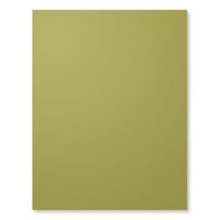
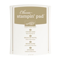
And what a winning combination this one is! I have surprised myself by doing a complete U-turn about Sweet Sugarplum. What do you mean “that’s not a surprise”? I never do U-turns about craft supplies. I thought it was a sickly colour but I’m happy to report that it’s quite “dirty” and not that sweet after all. It goes perfectly with Rich Razzleberry and the addition of Old Olive and Crumb Cake are just genius, if I do say so myself. 

I’m quite chuffed with the card, too. I love this new stamp set - Love You Lots. It’s a hostess set in the upcoming catalogue, which means you can only get it if you host a qualifying party or place an order of £150 or more. The animals are so cute and, as I’ve shown here, you don’t always have to colour them in the traditional way. 

Here I’ve painted swathes of colour across some watercolour paper. I used the ink pad lids of Old Olive, Sweet Sugarplum and Rich Razzleberry. When it was dry (I sped things up with the heat tool), I sprinkled some clean water over the top, left it for a few seconds then dabbed it with a tissue. I stamped the image on top - and love how it gives the impression that the elephant is blowing bubbles. 

I continued the “bubbles” theme by adding some clear and white sequins, and by embossing the Old Olive cardstock with Softly Falling. There’s a thank you sentiment with this set but I liked “A little thanks” as a nod towards the tiny mouse. Overthinking, me? Never!


Read More »


It’s Mix It Up Monday and a bank holiday no less – hope you have a relaxing day off!

In case you missed last Monday’s post, I’ve just started working my way through a new set of In Color charts, featuring 50 colour combinations using the 2015-17 In Colors. 


And what a winning combination this one is! I have surprised myself by doing a complete U-turn about Sweet Sugarplum. What do you mean “that’s not a surprise”? I never do U-turns about craft supplies. I thought it was a sickly colour but I’m happy to report that it’s quite “dirty” and not that sweet after all. It goes perfectly with Rich Razzleberry and the addition of Old Olive and Crumb Cake are just genius, if I do say so myself. 

I’m quite chuffed with the card, too. I love this new stamp set - Love You Lots. It’s a hostess set in the upcoming catalogue, which means you can only get it if you host a qualifying party or place an order of £150 or more. The animals are so cute and, as I’ve shown here, you don’t always have to colour them in the traditional way. 

Here I’ve painted swathes of colour across some watercolour paper. I used the ink pad lids of Old Olive, Sweet Sugarplum and Rich Razzleberry. When it was dry (I sped things up with the heat tool), I sprinkled some clean water over the top, left it for a few seconds then dabbed it with a tissue. I stamped the image on top - and love how it gives the impression that the elephant is blowing bubbles. 

I continued the “bubbles” theme by adding some clear and white sequins, and by embossing the Old Olive cardstock with Softly Falling. There’s a thank you sentiment with this set but I liked “A little thanks” as a nod towards the tiny mouse. Overthinking, me? Never!


Saturday, 28 May 2016

Caturday: Shifty cat


We’ve been fitting in a lot more walks lately... and when you actually go outside, you see a lot more cats! Here’s another one we spotted on our travels... probably had been up to something as she refused to look me in the eye!

Read More »


We’ve been fitting in a lot more walks lately... and when you actually go outside, you see a lot more cats! Here’s another one we spotted on our travels... probably had been up to something as she refused to look me in the eye!

Friday, 27 May 2016

Early bird ordering from the new catalogue


Are you up with the lark? Or do you still have items on the retiring list that you want to order before the end of May? Either way, please use the above ordering code if purchasing through my online store. Orders over £25 will earn a thank you gift from me! But if you’re planning to spend £150 or more, please don’t use the code, as you’ll get your own freebies!

The code is active now, so can be used for any purchases between now and 10am on June 1st (when I’ll be closing the order).

Thank you!
Read More »


Are you up with the lark? Or do you still have items on the retiring list that you want to order before the end of May? Either way, please use the above ordering code if purchasing through my online store. Orders over £25 will earn a thank you gift from me! But if you’re planning to spend £150 or more, please don’t use the code, as you’ll get your own freebies!

The code is active now, so can be used for any purchases between now and 10am on June 1st (when I’ll be closing the order).

Thank you!

Thursday, 26 May 2016

Masculine Projects for Father's Day


Saturday was my Masculine Workshop, so that the ladies could be prepared for Father’s Day in good time. There was also the option to use different greetings for various male relatives, if they wished. 

These were the three projects for the afternoon. I roped in my friend Kelly to creating these projects for me as I’ve been so busy with work lately – and didn’t she do a great job? 


The chocolate slider is quite a - okay, a very - complicated project, taken from a tutorial by German demonstrator Alexandra Grape. I’ve made lots of these before but still struggled on the day! You pull the ribbon to the right, and the greeting pops out at the left – genius!


Because this was such a time-consuming project, we kept the other two really simple. This wine tag is really easy – just a simple score line and a punched hole and you are halfway there.


The Open Sea card is really fun. It looks pretty unassuming from the outside...


But I particularly love the inside of the card, with its pop-out Chalk Lines waves and bobbing ship (well, it doesn’t really bob, but it looks like it does) as the front layer of waves are popped out on window sheets, concertina-style.


The projects also showcase lots of retiring products, including the Banner Punch, Bird Builder Punch, Going Places DSP, The Open Sea, Chalk Lines, map embossing folder, corrugated paper, black satin ribbon, circle and oval framelits, decorative label punch, mini brads, word window punch… not to mention the inks and cardstock in Lost Lagoon, Delightful Dijon and Mossy Meadow. Phew!

Some of them are carrying over to the new catalogue, though, including the lovely In The Meadow and really useful Guy Greetings, as well as the Scallop Tag Topper Punch. 


I’m not going to do a recipe as it will take ages and this post is long enough already! Plus, many of the items will be sold out by now. Anyway, I think it’s now time we started looking forward, not back – it’s new catalogue time in just a few days! 
Read More »


Saturday was my Masculine Workshop, so that the ladies could be prepared for Father’s Day in good time. There was also the option to use different greetings for various male relatives, if they wished. 

These were the three projects for the afternoon. I roped in my friend Kelly to creating these projects for me as I’ve been so busy with work lately – and didn’t she do a great job? 


The chocolate slider is quite a - okay, a very - complicated project, taken from a tutorial by German demonstrator Alexandra Grape. I’ve made lots of these before but still struggled on the day! You pull the ribbon to the right, and the greeting pops out at the left – genius!


Because this was such a time-consuming project, we kept the other two really simple. This wine tag is really easy – just a simple score line and a punched hole and you are halfway there.


The Open Sea card is really fun. It looks pretty unassuming from the outside...


But I particularly love the inside of the card, with its pop-out Chalk Lines waves and bobbing ship (well, it doesn’t really bob, but it looks like it does) as the front layer of waves are popped out on window sheets, concertina-style.


The projects also showcase lots of retiring products, including the Banner Punch, Bird Builder Punch, Going Places DSP, The Open Sea, Chalk Lines, map embossing folder, corrugated paper, black satin ribbon, circle and oval framelits, decorative label punch, mini brads, word window punch… not to mention the inks and cardstock in Lost Lagoon, Delightful Dijon and Mossy Meadow. Phew!

Some of them are carrying over to the new catalogue, though, including the lovely In The Meadow and really useful Guy Greetings, as well as the Scallop Tag Topper Punch. 


I’m not going to do a recipe as it will take ages and this post is long enough already! Plus, many of the items will be sold out by now. Anyway, I think it’s now time we started looking forward, not back – it’s new catalogue time in just a few days! 

Tuesday, 24 May 2016

In Color™ Share – three great options available


On Sunday, I sent out an email about an In Color™share... and by teatime all five slots had gone! But don’t despair, I’m pretty sure I can fill another share at least... and I can always use any leftovers myself. 

So if you’re like me, and take a while to grow to love new colours, this is a great opportunity to dip your toe into the water before investing your hard-earned cash.

I have three In Color Bundles available:


Bundle 1 – £20
My entry level In Color Bundle is perfect for those who aren’t sure if they want to commit fully to the new colours. It costs just £20 and includes a taste of cardstock, ribbon, DSP and embellishments. You’ll get:
  • 4 sheets of each cardstock
  • 1.5m of each ribbon
  • 1 sheet of each colour of DSP (cut into 6x6 sheets unless stated when ordering)
  • 1/5 pack of enamel shapes (8 of each colour)

Bundle 2 – £30
is for those who want to head a little deeper into the water. You get exactly the same as above, plus a set of In Color Markers, for the discounted price of £30.


Bundle 3 – £40
Bundle 3 is for those who like to jump feet first into the deep end - and enjoy the best bargain! Just £40 will get you all the items in Bundle 1, plus a set of five In Color Classic Stampin ’ Pads. 

Most people are opting for Bundle 3 because it’s such a great deal. Let me know if you’d like me to put your name down for any of the shares above. I will be ordering first thing on 1st June. 


The prices above are for collection from my house. If you wish to have your bundle posted to you (UK only), this will be charged at cost. 
Read More »


On Sunday, I sent out an email about an In Color™share... and by teatime all five slots had gone! But don’t despair, I’m pretty sure I can fill another share at least... and I can always use any leftovers myself. 

So if you’re like me, and take a while to grow to love new colours, this is a great opportunity to dip your toe into the water before investing your hard-earned cash.

I have three In Color Bundles available:


Bundle 1 – £20
My entry level In Color Bundle is perfect for those who aren’t sure if they want to commit fully to the new colours. It costs just £20 and includes a taste of cardstock, ribbon, DSP and embellishments. You’ll get:
  • 4 sheets of each cardstock
  • 1.5m of each ribbon
  • 1 sheet of each colour of DSP (cut into 6x6 sheets unless stated when ordering)
  • 1/5 pack of enamel shapes (8 of each colour)

Bundle 2 – £30
is for those who want to head a little deeper into the water. You get exactly the same as above, plus a set of In Color Markers, for the discounted price of £30.


Bundle 3 – £40
Bundle 3 is for those who like to jump feet first into the deep end - and enjoy the best bargain! Just £40 will get you all the items in Bundle 1, plus a set of five In Color Classic Stampin ’ Pads. 

Most people are opting for Bundle 3 because it’s such a great deal. Let me know if you’d like me to put your name down for any of the shares above. I will be ordering first thing on 1st June. 


The prices above are for collection from my house. If you wish to have your bundle posted to you (UK only), this will be charged at cost. 

Monday, 23 May 2016

Mix It Up Monday: Love You Lots with Emerald Envy


It’s Mix It Up Monday and time to start creating with my brand new set of In Color charts, featuring 50 colour combinations using the 2015-17 In Colors. 


I’ve started with a combo that’s WAY out of my comfort zone, using two brand new colours, Emerald Envy and... I can hardly bring myself to say the words... Peekaboo Peach. I’m going to feel SO ridiculous saying that colour name at Stampin’ Up!® parties! I even dug out my little-used Tempting Turquoise for the occasion. Definitely not my sort of colour combo but it seemed to fit the image. You’d be forgiven for missing this stamp set as it’s right at the back in the Stampin’ Rewards section, but do check it out. It’s called Love You Lots and you can earn it free when you host a £150 workshop. 

It’s just ripe for watercolouring, so that’s exactly what I did, using the ink in the lid of my Emerald Envy and Tempting Turquoise ink pads. 

Here’s a tip if you’re nervous about going over the edges (not that it matters, honest!) or about colours bleeding into each other and you’re too impatient to wait for them to dry. 

Start by painting with clean water. Paint the area you want to colour – in this case, the frog and, with a slight gap, the puddle below. Now, when you add the ink, it will only spread as far as the edges of the water and won’t bleed over the edges. Genius, eh?

And, of course, this gives you a useful margin for error: if your water painting goes “wrong”, you can allow it to dry and start again with no harm done. 

Watercolouring completed, I added a greeting with the new Thoughtful Banners stamp set and matching punch. To finish off, I had fun with some Timeless Textures spatters which, to my surprise, gave the card a bit of a 90s vibe; not sure why, but that’s the impression I get when looking at this project. 


Finally, I tried to photograph my project... and got photobombed!


Read More »


It’s Mix It Up Monday and time to start creating with my brand new set of In Color charts, featuring 50 colour combinations using the 2015-17 In Colors. 


I’ve started with a combo that’s WAY out of my comfort zone, using two brand new colours, Emerald Envy and... I can hardly bring myself to say the words... Peekaboo Peach. I’m going to feel SO ridiculous saying that colour name at Stampin’ Up!® parties! I even dug out my little-used Tempting Turquoise for the occasion. Definitely not my sort of colour combo but it seemed to fit the image. You’d be forgiven for missing this stamp set as it’s right at the back in the Stampin’ Rewards section, but do check it out. It’s called Love You Lots and you can earn it free when you host a £150 workshop. 

It’s just ripe for watercolouring, so that’s exactly what I did, using the ink in the lid of my Emerald Envy and Tempting Turquoise ink pads. 

Here’s a tip if you’re nervous about going over the edges (not that it matters, honest!) or about colours bleeding into each other and you’re too impatient to wait for them to dry. 

Start by painting with clean water. Paint the area you want to colour – in this case, the frog and, with a slight gap, the puddle below. Now, when you add the ink, it will only spread as far as the edges of the water and won’t bleed over the edges. Genius, eh?

And, of course, this gives you a useful margin for error: if your water painting goes “wrong”, you can allow it to dry and start again with no harm done. 

Watercolouring completed, I added a greeting with the new Thoughtful Banners stamp set and matching punch. To finish off, I had fun with some Timeless Textures spatters which, to my surprise, gave the card a bit of a 90s vibe; not sure why, but that’s the impression I get when looking at this project. 


Finally, I tried to photograph my project... and got photobombed!


Saturday, 21 May 2016

Caturday: one-eared kitty


Oh lordy, it's Caturday again already! I meant to post more projects during the week but it just didn’t happen. I DO have Monday’s project ready to post though... featuring a brand new stamp set from the new catalogue AND a brand new colour combination!

Meanwhile, it IS still Caturday, so here’s a lovely cat we found on a walk around Wirksworth last weekend. It was lurking on a wall under a tree and we wouldn’t have spotted it if it hadn’t shouted at us as we walked past. Clearly a cat in the Cobweb mould – shout and the humans will stroke you. Look closely at the picture... the poor cat only has one ear. We didn’t like to ask why.
Read More »

Oh lordy, it's Caturday again already! I meant to post more projects during the week but it just didn’t happen. I DO have Monday’s project ready to post though... featuring a brand new stamp set from the new catalogue AND a brand new colour combination!

Meanwhile, it IS still Caturday, so here’s a lovely cat we found on a walk around Wirksworth last weekend. It was lurking on a wall under a tree and we wouldn’t have spotted it if it hadn’t shouted at us as we walked past. Clearly a cat in the Cobweb mould – shout and the humans will stroke you. Look closely at the picture... the poor cat only has one ear. We didn’t like to ask why.

Wednesday, 18 May 2016

Just a note with Picture Perfect


Picture Perfect is a  beautiful stamp set which involves three-step – and even four-step – stamping. Some of the images take a little practice but the flower is fairly straightforward as there’s lots of margin for error in something as natural as petals.

The stamps are numbered, which helps, but can also hinder as it doesn’t always make sense to start at number 1! But it does for the petals, so I stamped in this order, with the following colours:

1. Blushing Bride
2. Calypso Coral
3. Watermelon Wonder.

For the leaves, however, I found that stamping in reverse order worked better. Also, to simplify things slightly for the Make & Take, I only stamped two of the steps, like so:

3. Mint Macaron
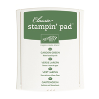
2. Garden Green

The background panel is created using Timeless Textures. I cannot stress enough how fantastic this stamp set is – if you love textured backgrounds or the shabby chic look, this set is an absolute must!


Read More »


Picture Perfect is a  beautiful stamp set which involves three-step – and even four-step – stamping. Some of the images take a little practice but the flower is fairly straightforward as there’s lots of margin for error in something as natural as petals.

The stamps are numbered, which helps, but can also hinder as it doesn’t always make sense to start at number 1! But it does for the petals, so I stamped in this order, with the following colours:

1. Blushing Bride
2. Calypso Coral
3. Watermelon Wonder.

For the leaves, however, I found that stamping in reverse order worked better. Also, to simplify things slightly for the Make & Take, I only stamped two of the steps, like so:

3. Mint Macaron
2. Garden Green

The background panel is created using Timeless Textures. I cannot stress enough how fantastic this stamp set is – if you love textured backgrounds or the shabby chic look, this set is an absolute must!