Saturday, 31 January 2009

Stamping the blues

A variation of this is a contender for the Winter Blues class on 7th February (now full, sorry!). 

The white card (can you tell it’s textured cardstock from the photo?) is one I made while playing around with the Summer Picnic colour scheme. 

It was the end of a long stamping session and I had a scrap of white which I stamped. I didn’t like the look of it but mounted it on to a scrap of Bashful Blue anyway. 

Eventually I came up with this card, which turned out to be one of my favourites from the day!


So I decided to adapt it for the Winter Blues class and remade it smaller (to suit the envelopes I have) in Bashful Blue, Bordering Blue and Basic Grey. Not a colour combination I would ever have tried, had I not been working with purely blues. Okay, okay, so grey isn’t blue but rules are there to be bent aren’t they?

I like the button detail on the white card but don’t have enough for a class of 20+ so left it off the blue card.

White card
Stamps: Pocket Silhouettes
Cardstock: Whisper White, Whisper White (textured), Bashful Blue, Old Olive
Ink: Bashful Blue, Old Olive
Accessories: Stitched ribbon - Bashful Blue, Earth Elements coloured buttons, scallop square punch, white gel pen

Blue card
Stamps: Pocket Silhouettes
Cardstock: Bordering Blue, Bashful Blue, Basic Grey, Whisper White
Ink: Bashful Blue, Bordering Blue
Accessories: Stitched ribbon - Bashful Blue, scallop square punch

All products by Stampin' Up! Please email me to order a catalogue, or click the picture of the catalogue on the right to view it online.

Read More » A variation of this is a contender for the Winter Blues class on 7th February (now full, sorry!). 

The white card (can you tell it’s textured cardstock from the photo?) is one I made while playing around with the Summer Picnic colour scheme. 

It was the end of a long stamping session and I had a scrap of white which I stamped. I didn’t like the look of it but mounted it on to a scrap of Bashful Blue anyway. 

Eventually I came up with this card, which turned out to be one of my favourites from the day!


So I decided to adapt it for the Winter Blues class and remade it smaller (to suit the envelopes I have) in Bashful Blue, Bordering Blue and Basic Grey. Not a colour combination I would ever have tried, had I not been working with purely blues. Okay, okay, so grey isn’t blue but rules are there to be bent aren’t they?

I like the button detail on the white card but don’t have enough for a class of 20+ so left it off the blue card.

White card
Stamps: Pocket Silhouettes
Cardstock: Whisper White, Whisper White (textured), Bashful Blue, Old Olive
Ink: Bashful Blue, Old Olive
Accessories: Stitched ribbon - Bashful Blue, Earth Elements coloured buttons, scallop square punch, white gel pen

Blue card
Stamps: Pocket Silhouettes
Cardstock: Bordering Blue, Bashful Blue, Basic Grey, Whisper White
Ink: Bashful Blue, Bordering Blue
Accessories: Stitched ribbon - Bashful Blue, scallop square punch

All products by Stampin' Up! Please email me to order a catalogue, or click the picture of the catalogue on the right to view it online.

Thursday, 29 January 2009

Hostess gift

To answer a couple of questions received in the comments sections recently.

1. Suzanne asked how I tie ribbon to make a neat knot. I have instructions here.
2. Elizabeth asked to see the Birthday Party in a Box projects. You can see them all here.

Do keep the questions coming – it makes me feel important!

And I have a question for my valued subscribers. If I edit a post  (because I want to add a label or I've seen a typo), do you get an email notification again? If you do, you'll be receiving all manner of old posts as I'm always doing it. And if that is the case, I apologise for the annoyance this must cause!  (Edited to add: I've just done it today - forgot to add the links to the above answers, doh!)

On to today’s project... this is a hostess gift for a party I’m doing soon – sadly I’ve had to reschedule due to a family bereavement. I’m sure she understands and I know she’ll love the stamp inside this box!

And luckily for blog readers, I have lots of projects made and posts already written which I will post erratically over the next few days.

The box is stamped with the new set Yummy, which you can earn free with an order of £45. There are three stamps in the set; I’ve actually only used one on here but it’s a big long stamp with the flourish on the left and the words on the right, so I separated them by stamping with markers. As the markers were out I thought I’d make full use of them so I stamped the words in different colours, too. Quite effective, I thought.

I made my own template for the box using the grid paper, which makes it so easy. As long as your sides are the same width as the base, you’re laughing.

I made the tag by cutting off one corner, then flipping over the discarded piece and using it as a guide to cut off the other corner. This is a fabulous tip from Stampin’ Up!® co-founder and CEO Shelli Gardner... it’s one of those that’s so obvious you wonder why you didn’t think of it yourself! Or maybe you did and I’m just thick.

I had run out of tissue paper so just shredded some printer paper to fill the top.

Stamps: Yummy (SAB)
Cardstock: Regal Rose, Whisper White
Paper: Sweet Always
Ink: Rose Red, Regal Rose markers
Accessories: Whisper White Grosgrain Ribbon, scallop edge punch, rhinestone brads

All products by Stampin' Up! Please email me to order a catalogue, or click the link on the right to view it online.


Read More » To answer a couple of questions received in the comments sections recently.

1. Suzanne asked how I tie ribbon to make a neat knot. I have instructions here.
2. Elizabeth asked to see the Birthday Party in a Box projects. You can see them all here.

Do keep the questions coming – it makes me feel important!

And I have a question for my valued subscribers. If I edit a post  (because I want to add a label or I've seen a typo), do you get an email notification again? If you do, you'll be receiving all manner of old posts as I'm always doing it. And if that is the case, I apologise for the annoyance this must cause!  (Edited to add: I've just done it today - forgot to add the links to the above answers, doh!)

On to today’s project... this is a hostess gift for a party I’m doing soon – sadly I’ve had to reschedule due to a family bereavement. I’m sure she understands and I know she’ll love the stamp inside this box!

And luckily for blog readers, I have lots of projects made and posts already written which I will post erratically over the next few days.

The box is stamped with the new set Yummy, which you can earn free with an order of £45. There are three stamps in the set; I’ve actually only used one on here but it’s a big long stamp with the flourish on the left and the words on the right, so I separated them by stamping with markers. As the markers were out I thought I’d make full use of them so I stamped the words in different colours, too. Quite effective, I thought.

I made my own template for the box using the grid paper, which makes it so easy. As long as your sides are the same width as the base, you’re laughing.

I made the tag by cutting off one corner, then flipping over the discarded piece and using it as a guide to cut off the other corner. This is a fabulous tip from Stampin’ Up!® co-founder and CEO Shelli Gardner... it’s one of those that’s so obvious you wonder why you didn’t think of it yourself! Or maybe you did and I’m just thick.

I had run out of tissue paper so just shredded some printer paper to fill the top.

Stamps: Yummy (SAB)
Cardstock: Regal Rose, Whisper White
Paper: Sweet Always
Ink: Rose Red, Regal Rose markers
Accessories: Whisper White Grosgrain Ribbon, scallop edge punch, rhinestone brads

All products by Stampin' Up! Please email me to order a catalogue, or click the link on the right to view it online.


Tuesday, 27 January 2009

Get this stamp set FREE!

This is a gorgeous stamp set which will appeal to anyone who loved Heartfelt (hostess set) from the old catalogue but didn’t make a Level 3 workshop to earn it. This set, Botanical Blooms, is MUCH easier to earn... all you have to do is spend £45 during January or February.

There are seven stamps; three sets of two-step stamps plus a word stamp. There’s another flower and you can just see the leaf along the bottom of the card) and a sentiment: “to thine own self be kind”. Unless you fancy it in French or German!

As with most of Stampin’ Up!’s® two-step stamps, they are not made to fit perfectly, which really takes the pressure off when stamping and gives a lovely effect.

I love the look of this flower, stamped in colours from the Sweet Always Designer Series Paper collection. A strip of Sweet Always paper just sets it off. I wouldn’t have put these colours together myself but wanted to match the paper and now love the combination!

The tags are made with two tag punches – a boon if you don’t like fiddly cutting. I also used a tag punch to create the “photo corner” out of a scrap of Chocolate Chip cardstock. Punch your tag, then set to one side. Then insert the leftover piece back into the punch, to create a shape which looks like the section of a window frame. Remove and trim with scissors to create the photo corner.

Stamps: Botanical Blooms
Cardstock: Regal Rose, Pumpkin Pie, Chocolate Chip, Whisper White
Paper: Sweet Always
Ink: Pumpkin Pie, Chocolate Chip, Regal Rose
Accessories: Tag punch, Small Tag punch, ¼” Grosgrain Ribbon - Chocolate Chip

All products by Stampin' Up! Please email me to order a catalogue, or click the picture of the catalogue on the right to view it online.

Read More » This is a gorgeous stamp set which will appeal to anyone who loved Heartfelt (hostess set) from the old catalogue but didn’t make a Level 3 workshop to earn it. This set, Botanical Blooms, is MUCH easier to earn... all you have to do is spend £45 during January or February.

There are seven stamps; three sets of two-step stamps plus a word stamp. There’s another flower and you can just see the leaf along the bottom of the card) and a sentiment: “to thine own self be kind”. Unless you fancy it in French or German!

As with most of Stampin’ Up!’s® two-step stamps, they are not made to fit perfectly, which really takes the pressure off when stamping and gives a lovely effect.

I love the look of this flower, stamped in colours from the Sweet Always Designer Series Paper collection. A strip of Sweet Always paper just sets it off. I wouldn’t have put these colours together myself but wanted to match the paper and now love the combination!

The tags are made with two tag punches – a boon if you don’t like fiddly cutting. I also used a tag punch to create the “photo corner” out of a scrap of Chocolate Chip cardstock. Punch your tag, then set to one side. Then insert the leftover piece back into the punch, to create a shape which looks like the section of a window frame. Remove and trim with scissors to create the photo corner.

Stamps: Botanical Blooms
Cardstock: Regal Rose, Pumpkin Pie, Chocolate Chip, Whisper White
Paper: Sweet Always
Ink: Pumpkin Pie, Chocolate Chip, Regal Rose
Accessories: Tag punch, Small Tag punch, ¼” Grosgrain Ribbon - Chocolate Chip

All products by Stampin' Up! Please email me to order a catalogue, or click the picture of the catalogue on the right to view it online.

Monday, 26 January 2009

An apple a day

Look! No Real Red! But an awful lot of Old Olive, and a fairly dark photo, too.

As you can see, the Summer Picnic paper is a perfect match for the Tart & Tangy stamp set – I love it when a plan comes together!

Not sure if you can see but the apple is embossed with clear embossing powder. To do this with Classic Stampin’ Pads, ink your stamp with Versamark first and then with your coloured ink. Stamp and then emboss as usual. It’s VERY important to use Versamark first, then the colour because if you do it the other way round, you’ll ruin your Versamark pad. Ask me how I know.

It’s also quite important to wrap your ribbon strips around your Pumpkin Pie cardstock before sticking it to the Designer Paper... or you’ll have to get a butter knife out to create a gap to thread the ribbon through and work really hard not to crease the paper. But don’t tell anyone I told you that.

Stamps: Tart & Tangy, Seasonal Wishes
Cardstock: Old Olive, Pumpkin Pie, Whisper White
Paper: Summer Picnic
Ink: Old Olive, Versamark
Accessories: clear embossing powder, ¼” Grosgrain Ribbon –Whisper White, Stampin’ Dimensionals

All products by Stampin' Up! Please email me to order a catalogue, or click the picture of the catalogue on the right to view it online.
Read More » Look! No Real Red! But an awful lot of Old Olive, and a fairly dark photo, too.

As you can see, the Summer Picnic paper is a perfect match for the Tart & Tangy stamp set – I love it when a plan comes together!

Not sure if you can see but the apple is embossed with clear embossing powder. To do this with Classic Stampin’ Pads, ink your stamp with Versamark first and then with your coloured ink. Stamp and then emboss as usual. It’s VERY important to use Versamark first, then the colour because if you do it the other way round, you’ll ruin your Versamark pad. Ask me how I know.

It’s also quite important to wrap your ribbon strips around your Pumpkin Pie cardstock before sticking it to the Designer Paper... or you’ll have to get a butter knife out to create a gap to thread the ribbon through and work really hard not to crease the paper. But don’t tell anyone I told you that.

Stamps: Tart & Tangy, Seasonal Wishes
Cardstock: Old Olive, Pumpkin Pie, Whisper White
Paper: Summer Picnic
Ink: Old Olive, Versamark
Accessories: clear embossing powder, ¼” Grosgrain Ribbon –Whisper White, Stampin’ Dimensionals

All products by Stampin' Up! Please email me to order a catalogue, or click the picture of the catalogue on the right to view it online.

Saturday, 24 January 2009

Keep taking the strawberries

This is a long card which opens at the left, which was no mean feat... well, I had to join the colours so I thought I’d make a feature of it. Not sure about this at all, it’s a bit bonkers and I think there’s too much Old Olive (as if that’s possible!) on the left. But I kept adding more and more elements until I thought I’d better stop.

I coloured the strawberry with Stampin’ Write markers. To create the faux stitching (which went a bit wrong – I think there are supposed to be gaps), pierce a row of holes, then join them up with a white gel pen.

Stamps: Tart & Tangy, Seasonal Greetings
Cardstock: Real Red, Old Olive, Bashful Blue, Whisper White
Paper: Summer Picnic
Ink: Versamark, Real Red
Accessories: White gel pen, Crafters’ Toolkit, stapler, Stitched Grosgrain – Bashful Blue, ¼” circle punch, 1 3/8” circle punch, Scallop Circle Punch, Round Tab Punch, Scallop Edge Punch

All products by Stampin' Up! Please email me to order a catalogue, or click the picture of the catalogue on the right to view it online.
Read More » This is a long card which opens at the left, which was no mean feat... well, I had to join the colours so I thought I’d make a feature of it. Not sure about this at all, it’s a bit bonkers and I think there’s too much Old Olive (as if that’s possible!) on the left. But I kept adding more and more elements until I thought I’d better stop.

I coloured the strawberry with Stampin’ Write markers. To create the faux stitching (which went a bit wrong – I think there are supposed to be gaps), pierce a row of holes, then join them up with a white gel pen.

Stamps: Tart & Tangy, Seasonal Greetings
Cardstock: Real Red, Old Olive, Bashful Blue, Whisper White
Paper: Summer Picnic
Ink: Versamark, Real Red
Accessories: White gel pen, Crafters’ Toolkit, stapler, Stitched Grosgrain – Bashful Blue, ¼” circle punch, 1 3/8” circle punch, Scallop Circle Punch, Round Tab Punch, Scallop Edge Punch

All products by Stampin' Up! Please email me to order a catalogue, or click the picture of the catalogue on the right to view it online.

Thursday, 22 January 2009

More fruit ... it's good for you!

This didn’t turn out anything like I had planned. In fact, I don’t really know what I was planning... but I know it wasn’t this. Ah, the joys of cardmaking!

Stamps: Tart & Tangy
Cardstock: Bashful Blue, Old Olive, Whisper White
Paper: Summer Picnic
Ink: Real Red and Old Olive Stampin’ Write® markers
Accessories: Stitched ribbon - Bashful Blue, corner rounder

All products by Stampin' Up! Please email me to order a catalogue, or click the picture of the catalogue on the right to view it online.
Read More » This didn’t turn out anything like I had planned. In fact, I don’t really know what I was planning... but I know it wasn’t this. Ah, the joys of cardmaking!

Stamps: Tart & Tangy
Cardstock: Bashful Blue, Old Olive, Whisper White
Paper: Summer Picnic
Ink: Real Red and Old Olive Stampin’ Write® markers
Accessories: Stitched ribbon - Bashful Blue, corner rounder

All products by Stampin' Up! Please email me to order a catalogue, or click the picture of the catalogue on the right to view it online.

Tuesday, 20 January 2009

Fun with rub-ons

This is not a Real Red and Old Olive card, I promise you. If you look closely, there’s a hint of Bashful Blue on that second layer.

I was playing around with rub-ons for this card – they’re very fun to use and I love the look of stark white on a colour like Real Red.

Cardstock: Old Olive, Real Red, Bashful Blue
Accessories: Hidden Garden Blossoms rub-ons, Scallop Edge Punch, ¼” Grosgrain Ribbon – Whisper White

All products by Stampin' Up! Please email me to order a catalogue, or click the picture of the catalogue on the right to view it online.
Read More » This is not a Real Red and Old Olive card, I promise you. If you look closely, there’s a hint of Bashful Blue on that second layer.

I was playing around with rub-ons for this card – they’re very fun to use and I love the look of stark white on a colour like Real Red.

Cardstock: Old Olive, Real Red, Bashful Blue
Accessories: Hidden Garden Blossoms rub-ons, Scallop Edge Punch, ¼” Grosgrain Ribbon – Whisper White

All products by Stampin' Up! Please email me to order a catalogue, or click the picture of the catalogue on the right to view it online.

Monday, 19 January 2009

Summer cherries

Staying with Tart & Tangy, here’s a card made with the cherry stamps. It’s a very cute stamp and I like it best when inked with markers, as I’ve done here. It fits the Square Scallop Punch perfectly.

Stamps: Tart and Tangy, Best Wishes & More
Cardstock: Bashful Blue, Real Red, Old Olive
Paper: Summer Picnic
Ink: Real Red
Accessories: scallop square punch, red gingham ribbon, round tab punch, Stampin’ Write® markers

All products by Stampin' Up! Please email me to order a catalogue, or click the picture of the catalogue on the right to view it online.
Read More » Staying with Tart & Tangy, here’s a card made with the cherry stamps. It’s a very cute stamp and I like it best when inked with markers, as I’ve done here. It fits the Square Scallop Punch perfectly.

Stamps: Tart and Tangy, Best Wishes & More
Cardstock: Bashful Blue, Real Red, Old Olive
Paper: Summer Picnic
Ink: Real Red
Accessories: scallop square punch, red gingham ribbon, round tab punch, Stampin’ Write® markers

All products by Stampin' Up! Please email me to order a catalogue, or click the picture of the catalogue on the right to view it online.

Saturday, 17 January 2009

Summer picnic handbag

Remember last autumn when I had a run on Old Olive and Real Red? Well, I’ll warn you now, this is the beginning of another one of those long runs of projects made from the same colours.

I like the look of colour co-ordinated samples so much that I’m doing it again... this time with projects made with the colours from the Summer Picnic Designer Series Paper. The colours from these papers are Bashful Blue, Pumpkin Pie, Old Olive and Real Red, so you’ll be seeing a lot of those in the next few weeks. Yes, I realise that’s just an extension of Old Olive and Real Red... perhaps that’s why I was drawn to these papers!

Here’s my first sample... a return to the handbag card (I was using scraps and found one ready cut in the box!). It’s very easy to make – just cut your usual card shape, then measure along the fold 1” in from each edge and mark. Then cut from each mark down to the relevant corner. Make two holes for the ribbon and you have your handbag.

Stamps: Tart & Tangy, Sincere Salutations
Cardstock: Bashful Blue, Real Red, Old Olive
Paper: Summer Picnic
Ink: Versamark, Real Red
Accessories: 5/8” Grosgrain Ribbon – Old Olive, ¼” Grosgrain Ribbon - Real Red, 1 ¼” circle punch, 1 3/8” circle punch, scallop circle punch

All products by Stampin' Up! Please email me to order a catalogue, or click the picture of the catalogue on the right to view it online.
Read More » Remember last autumn when I had a run on Old Olive and Real Red? Well, I’ll warn you now, this is the beginning of another one of those long runs of projects made from the same colours.

I like the look of colour co-ordinated samples so much that I’m doing it again... this time with projects made with the colours from the Summer Picnic Designer Series Paper. The colours from these papers are Bashful Blue, Pumpkin Pie, Old Olive and Real Red, so you’ll be seeing a lot of those in the next few weeks. Yes, I realise that’s just an extension of Old Olive and Real Red... perhaps that’s why I was drawn to these papers!

Here’s my first sample... a return to the handbag card (I was using scraps and found one ready cut in the box!). It’s very easy to make – just cut your usual card shape, then measure along the fold 1” in from each edge and mark. Then cut from each mark down to the relevant corner. Make two holes for the ribbon and you have your handbag.

Stamps: Tart & Tangy, Sincere Salutations
Cardstock: Bashful Blue, Real Red, Old Olive
Paper: Summer Picnic
Ink: Versamark, Real Red
Accessories: 5/8” Grosgrain Ribbon – Old Olive, ¼” Grosgrain Ribbon - Real Red, 1 ¼” circle punch, 1 3/8” circle punch, scallop circle punch

All products by Stampin' Up! Please email me to order a catalogue, or click the picture of the catalogue on the right to view it online.

Thursday, 15 January 2009

A tiny tin

I am having a bit of a run on Altoid tins – they’re so quick and cute to alter. Click here for a tutorial if you need a reminder.

As this is a recycled Altoid mint tin, with printing on the lid and base, I covered both sides with some of the new Designer Series Paper – the bright and cheerful Summer Picnic. The striped strip is the other side of the same sheet, so I only had to cut into one, which pleased me as I struggle to cut into my new Designer Papers!

The flower stamp from Best Wishes & More co-ordinates perfectly with this paper, as so often with Stampin’ Up!® products, so I added a flower to the top.

I am running out of Mod Podge so I thought I’d test the theory that PVA glue amounts to pretty much the same thing. Well the result was is that it worked absolutely fine on the Designer Paper but made the ink of the flower run horribly. 

I tried again with Mod Podge, this time covering the flower before I cut it out. I discovered that, while the Mod Podge did make the ink run a little, it wasn’t as bad as with the PVA, so I made sure that the pink around the edges was uniform and went with it. If you look closely, you’ll see that there are two layers of flower on the tin now. I make mistakes so you don't have to!

To avoid any colour bleeding, I could have embossed the flower using red ink and clear embossing powder – I’ll do that next time.

I’m sure you’ll want to know what’s inside this one... emergency chocolate of course! These mini Bournevilles fit perfectly.

Stamps: Best Wishes & More
Cardstock: Bashful Blue
Paper: Summer Picnic
Ink: Real Red
Accessories: ¼” Grosgrain Ribbon – Real Red, Sticky Strip

All products by Stampin' Up! Please email me to order a catalogue, or click the picture of the catalogue on the right to view it online.
Read More » I am having a bit of a run on Altoid tins – they’re so quick and cute to alter. Click here for a tutorial if you need a reminder.

As this is a recycled Altoid mint tin, with printing on the lid and base, I covered both sides with some of the new Designer Series Paper – the bright and cheerful Summer Picnic. The striped strip is the other side of the same sheet, so I only had to cut into one, which pleased me as I struggle to cut into my new Designer Papers!

The flower stamp from Best Wishes & More co-ordinates perfectly with this paper, as so often with Stampin’ Up!® products, so I added a flower to the top.

I am running out of Mod Podge so I thought I’d test the theory that PVA glue amounts to pretty much the same thing. Well the result was is that it worked absolutely fine on the Designer Paper but made the ink of the flower run horribly. 

I tried again with Mod Podge, this time covering the flower before I cut it out. I discovered that, while the Mod Podge did make the ink run a little, it wasn’t as bad as with the PVA, so I made sure that the pink around the edges was uniform and went with it. If you look closely, you’ll see that there are two layers of flower on the tin now. I make mistakes so you don't have to!

To avoid any colour bleeding, I could have embossed the flower using red ink and clear embossing powder – I’ll do that next time.

I’m sure you’ll want to know what’s inside this one... emergency chocolate of course! These mini Bournevilles fit perfectly.

Stamps: Best Wishes & More
Cardstock: Bashful Blue
Paper: Summer Picnic
Ink: Real Red
Accessories: ¼” Grosgrain Ribbon – Real Red, Sticky Strip

All products by Stampin' Up! Please email me to order a catalogue, or click the picture of the catalogue on the right to view it online.

Tuesday, 13 January 2009

Class bookings now being taken

I have some class dates for you at last! The hall is booked, the themes are decided - all we need now is the stampers! So please email me as soon as possible if you'd like to join one of these classes, especially if you're interested in the Winter Blues class, which is very soon!

Winter Blues
Banish the winter blues by making four projects in cool shades of blue.
Saturday, 7th February, 1.30pm-4pm

Make Mother's Day
Create a beautiful card and gift ensemble for your mother, or another special lady in your life. 
Saturday, 7th March, 1.30pm-4pm

Steal a March on Christmas
...because you can NEVER start too early! Create four Christmas cards to get a head start.
Saturday, 28th March, 1.30pm-4pm

All classes will be held at the same venue, about 20 minutes from Derby. Full details on request.

The cost for each class is £5.50, which includes refreshments and a free prize draw. All materials and equipment also provided. Fees are payable in advance (to allow purchase of supplies) and are non-refundable. 

Places are limited so please book early!

More classes are planned for later in the year, so watch this space! 
Read More » I have some class dates for you at last! The hall is booked, the themes are decided - all we need now is the stampers! So please email me as soon as possible if you'd like to join one of these classes, especially if you're interested in the Winter Blues class, which is very soon!

Winter Blues
Banish the winter blues by making four projects in cool shades of blue.
Saturday, 7th February, 1.30pm-4pm

Make Mother's Day
Create a beautiful card and gift ensemble for your mother, or another special lady in your life. 
Saturday, 7th March, 1.30pm-4pm

Steal a March on Christmas
...because you can NEVER start too early! Create four Christmas cards to get a head start.
Saturday, 28th March, 1.30pm-4pm

All classes will be held at the same venue, about 20 minutes from Derby. Full details on request.

The cost for each class is £5.50, which includes refreshments and a free prize draw. All materials and equipment also provided. Fees are payable in advance (to allow purchase of supplies) and are non-refundable. 

Places are limited so please book early!

More classes are planned for later in the year, so watch this space! 

Monday, 12 January 2009

My top 10

I've noticed lots of bloggers posting their 10 favourite projects of 2008 so I thought I'd better jump on the bandwagon before it left without me! So, in no particular order, here are my 10 favourites. It feels weird to be slapping myself on the back but I think we should do it more often. We spend so long looking at our handmade projects saying "I should have..." or "I messed up that bit", that perhaps we should take some time to say what we like about our work instead.

You may notice a theme in the projects I've chosen - a high proportion of them use Old Olive for a start. And Lovely as a Tree crops up more than once, first of all in this card, which we made at Chocolate Night. I love this masking technique, this stamp set and these warm chocolatey colours. You can see the original post and the recipe by clicking here.


Here's another tree card, made mostly from scraps from my bulging Earth Elements box. Click here for more detail.


Next up is this French trio - I'm not really cheating by picking three as they're all so similar. Carte Postale isn't one my favourite stamp sets - although it is a favourite of my customers - but I do like these cards, especially the lovely colour combination. You can see the original post here.


This is a very plain and simple card but that's what I like about it. I also love the colour combination - I don't use Sahara Sand very often but it's such a useful colour that maybe I should! I return to this card design over and again - it's quick and easy and, well, I like it! This was a birthday card to go with a box set of cards, which you can see here.


Hate snails but love this card! I love the fact that the snail spins and seemingly changes colour... and I love the unusual but funky colour combo! Click here for the original post and here for a tutorial on suspension cards.


This was a really quick project to complete but it's so bright and cheerful that I have to include it. I love how it turned out - read more here.


I loved these beach hut mini albums, which were such fun and so easy (albeit time-consuming) to make! Maybe I'll visit a beach this summer and take some pix to put inside them! See here for all the details.


This card was very different for me but I loved how it turned out. I love the combination of Real Read and lovely Old Olive; I love chipboard and I love the fact that I managed to complete this without cutting off one of the frog's legs! Here's the original post.


I love this little coaster book - partly because of that funky colour scheme again. The details are all here.


And finally... I think this was my favourite project of 2008. It was certainly the most confusing, frustrating and time-consuming! But I love it and will one day get round to making another one. It's a pop-up album and this picture doesn't do it justice - please click here to see it in its full glory!
Read More » I've noticed lots of bloggers posting their 10 favourite projects of 2008 so I thought I'd better jump on the bandwagon before it left without me! So, in no particular order, here are my 10 favourites. It feels weird to be slapping myself on the back but I think we should do it more often. We spend so long looking at our handmade projects saying "I should have..." or "I messed up that bit", that perhaps we should take some time to say what we like about our work instead.

You may notice a theme in the projects I've chosen - a high proportion of them use Old Olive for a start. And Lovely as a Tree crops up more than once, first of all in this card, which we made at Chocolate Night. I love this masking technique, this stamp set and these warm chocolatey colours. You can see the original post and the recipe by clicking here.


Here's another tree card, made mostly from scraps from my bulging Earth Elements box. Click here for more detail.


Next up is this French trio - I'm not really cheating by picking three as they're all so similar. Carte Postale isn't one my favourite stamp sets - although it is a favourite of my customers - but I do like these cards, especially the lovely colour combination. You can see the original post here.


This is a very plain and simple card but that's what I like about it. I also love the colour combination - I don't use Sahara Sand very often but it's such a useful colour that maybe I should! I return to this card design over and again - it's quick and easy and, well, I like it! This was a birthday card to go with a box set of cards, which you can see here.


Hate snails but love this card! I love the fact that the snail spins and seemingly changes colour... and I love the unusual but funky colour combo! Click here for the original post and here for a tutorial on suspension cards.


This was a really quick project to complete but it's so bright and cheerful that I have to include it. I love how it turned out - read more here.


I loved these beach hut mini albums, which were such fun and so easy (albeit time-consuming) to make! Maybe I'll visit a beach this summer and take some pix to put inside them! See here for all the details.


This card was very different for me but I loved how it turned out. I love the combination of Real Read and lovely Old Olive; I love chipboard and I love the fact that I managed to complete this without cutting off one of the frog's legs! Here's the original post.


I love this little coaster book - partly because of that funky colour scheme again. The details are all here.


And finally... I think this was my favourite project of 2008. It was certainly the most confusing, frustrating and time-consuming! But I love it and will one day get round to making another one. It's a pop-up album and this picture doesn't do it justice - please click here to see it in its full glory!

Friday, 9 January 2009

Get cracking!

Sorry for the delay in posting, I've been off sick with some horrible cold/flu thingy. Hope this huuuuuuge post will make up for it!

It's the long-awaited cracked glass technique tutorial that I promised you back in September (was it really that long ago?) in this post.


With this card I set myself a little challenge. I realise there are some Stampin' Up!® colours which I neglect because, dare I say it? Well, I just don't like them. Taken With Teal is one of them. Every time I try to use it, I end up using Tempting Turquoise instead. So this year I am going to try to use some of my least favourite colours and learn to like them!

This challenge was easy as I was inspired by Alison's striped jumper, which was Taken with Teal, Old Olive, Certainly Celery and Night of Navy. Her jumper looked good so I thought I'd get on with the colours for a card, too - and I do quite like them together! So that's a success story for Taken With Teal!

So, on to the cracked glass tutorial.

For this technique, you will need:
Stamps
Cardstock
Ink pad
Versamark® ink pad or embossing pad
Clear embossing powder or Ultra Thick Embossing Enamel (UTEE)
A heat gun
Access to a freezer (yes, a freezer)

The short version:
You emboss all over a piece of cardstock, several times so that the layer of embossing is nice and thick. Then you freeze it so it’s brittle and manipulate it so that the embossing cracks all over.

The detailed version:

1. Stamp your image on a piece of cardstock either the size you want it to be or slightly larger. Don’t make it too large or you will end up wasting a lot of embossing powder.


2. Ink the entire piece with Versamark.


3. Cover the inked cardstock with embossing powder or UTEE then heat to emboss.


4. While the embossed layer is still melted, add another layer of powder and heat again. If only part of the image retains the embossing powder, you weren’t quick enough – but don’t worry about it, just heat it to melt and try again. If this keeps happening, you may be better to allow the cardstock to cool each time, then add more Versamark to make the next layer of powder stick. But if you can work quickly and add powder while the previous layer is still melted, it does save time.


5. Repeat as necessary. If you are using ordinary embossing powder, you will probably need about five layers. If using UTEE, three layers should be enough. You’ll see from the picture that I used tweezers to hold the cardstock; this is because heated embossing powder is VERY hot, and sticks to your skin. Ask me how I know. You’ll also notice that there is a small area that is not embossed. You can either trim this off or patch it up with more Versamark and embossing powder.


7. Your image will now be cold and, as you can see, probably curled up, too. Don’t worry about this.


8. While it is still cold, manipulate it gently until the embossing powder cracks. The great thing about this technique is that, if you don’t like the look of the cracking, you can heat it up and start again!


9. If you like, you can add some colour to the cracks. I did this using Stampin’ Pastels® but found that it coloured the whole of the embossed piece. If you want colour just in the cracks, try using ink from your ink pad and rubbing it in using a sponge or piece of kitchen roll. Then use a damp piece to wipe off the excess.


10. Trim the cardstock if necessary and prepare to attach to your project. As the cardstock is curled you will need a strong adhesive, like Sticky Strip.

Stamps: Pocket Silhouettes
Cardstock: Taken with Teal, Old Olive, Certainly Celery, Night of Navy, Very Vanilla
Ink: Old Olive, Versamark
Accessories: Embossing powder, heat gun, Stampin’ Pastels®, sponge dauber, 1 1/4” circle punch, Hodgepodge Hardware® - Pewter


Read More » Sorry for the delay in posting, I've been off sick with some horrible cold/flu thingy. Hope this huuuuuuge post will make up for it!

It's the long-awaited cracked glass technique tutorial that I promised you back in September (was it really that long ago?) in this post.


With this card I set myself a little challenge. I realise there are some Stampin' Up!® colours which I neglect because, dare I say it? Well, I just don't like them. Taken With Teal is one of them. Every time I try to use it, I end up using Tempting Turquoise instead. So this year I am going to try to use some of my least favourite colours and learn to like them!

This challenge was easy as I was inspired by Alison's striped jumper, which was Taken with Teal, Old Olive, Certainly Celery and Night of Navy. Her jumper looked good so I thought I'd get on with the colours for a card, too - and I do quite like them together! So that's a success story for Taken With Teal!

So, on to the cracked glass tutorial.

For this technique, you will need:
Stamps
Cardstock
Ink pad
Versamark® ink pad or embossing pad
Clear embossing powder or Ultra Thick Embossing Enamel (UTEE)
A heat gun
Access to a freezer (yes, a freezer)

The short version:
You emboss all over a piece of cardstock, several times so that the layer of embossing is nice and thick. Then you freeze it so it’s brittle and manipulate it so that the embossing cracks all over.

The detailed version:

1. Stamp your image on a piece of cardstock either the size you want it to be or slightly larger. Don’t make it too large or you will end up wasting a lot of embossing powder.


2. Ink the entire piece with Versamark.


3. Cover the inked cardstock with embossing powder or UTEE then heat to emboss.


4. While the embossed layer is still melted, add another layer of powder and heat again. If only part of the image retains the embossing powder, you weren’t quick enough – but don’t worry about it, just heat it to melt and try again. If this keeps happening, you may be better to allow the cardstock to cool each time, then add more Versamark to make the next layer of powder stick. But if you can work quickly and add powder while the previous layer is still melted, it does save time.


5. Repeat as necessary. If you are using ordinary embossing powder, you will probably need about five layers. If using UTEE, three layers should be enough. You’ll see from the picture that I used tweezers to hold the cardstock; this is because heated embossing powder is VERY hot, and sticks to your skin. Ask me how I know. You’ll also notice that there is a small area that is not embossed. You can either trim this off or patch it up with more Versamark and embossing powder.


7. Your image will now be cold and, as you can see, probably curled up, too. Don’t worry about this.


8. While it is still cold, manipulate it gently until the embossing powder cracks. The great thing about this technique is that, if you don’t like the look of the cracking, you can heat it up and start again!


9. If you like, you can add some colour to the cracks. I did this using Stampin’ Pastels® but found that it coloured the whole of the embossed piece. If you want colour just in the cracks, try using ink from your ink pad and rubbing it in using a sponge or piece of kitchen roll. Then use a damp piece to wipe off the excess.


10. Trim the cardstock if necessary and prepare to attach to your project. As the cardstock is curled you will need a strong adhesive, like Sticky Strip.

Stamps: Pocket Silhouettes
Cardstock: Taken with Teal, Old Olive, Certainly Celery, Night of Navy, Very Vanilla
Ink: Old Olive, Versamark
Accessories: Embossing powder, heat gun, Stampin’ Pastels®, sponge dauber, 1 1/4” circle punch, Hodgepodge Hardware® - Pewter


Wednesday, 7 January 2009

Stamp to spend?

Some of my fellow demonstrators are taking part in a Stamp to Spend challenge, which you can either use as a way of controlling your spending, or as a way of justifying your addiction – whichever way you want to look at it!

The idea is that, for every project you create (card, scrapbook page, altered item etc), you “earn” a certain amount to spend on more crafting supplies. This is both a great way to get you using your current supplies and makes you feel a lot better about spending when you do splash out. And every card you make and send is at least £1.20 (and usually much more than that) that you’ve saved on a shop-bought card.

You could go for a simple £1 per item, or a less straightforward system, such as:

£1 per card
£2 per altered item
£3 per scrapbook page

Some are going for more generous budgets (£5 per scrapbook page) or more ambitious targets (£15 for every 10 cards made). Just change the numbers to suit your budget.

I haven’t decided if I’m taking up this challenge just yet but if I did, I could have earned myself a couple of quid to spend with this easy peasy altered candle-holder. In fact, rub-ons are soooooo easy to use that I can’t imagine there being a difficult rub-ons project. The glass candle-holder was really cheap and came from Home Bargains or Wilko (I can’t remember, have been hoarding it a while). The rub-on went on very easily and should stay there as long as I don’t do anything stupid to it like stick it in a dishwasher. And there's little chance of that as I don't have one! 

Supplies: Hidden Garden Blossoms rub-ons

All products by Stampin' Up! Please email me to order a catalogue, or click the picture of the catalogue on the right to view it online.

Read More » Some of my fellow demonstrators are taking part in a Stamp to Spend challenge, which you can either use as a way of controlling your spending, or as a way of justifying your addiction – whichever way you want to look at it!

The idea is that, for every project you create (card, scrapbook page, altered item etc), you “earn” a certain amount to spend on more crafting supplies. This is both a great way to get you using your current supplies and makes you feel a lot better about spending when you do splash out. And every card you make and send is at least £1.20 (and usually much more than that) that you’ve saved on a shop-bought card.

You could go for a simple £1 per item, or a less straightforward system, such as:

£1 per card
£2 per altered item
£3 per scrapbook page

Some are going for more generous budgets (£5 per scrapbook page) or more ambitious targets (£15 for every 10 cards made). Just change the numbers to suit your budget.

I haven’t decided if I’m taking up this challenge just yet but if I did, I could have earned myself a couple of quid to spend with this easy peasy altered candle-holder. In fact, rub-ons are soooooo easy to use that I can’t imagine there being a difficult rub-ons project. The glass candle-holder was really cheap and came from Home Bargains or Wilko (I can’t remember, have been hoarding it a while). The rub-on went on very easily and should stay there as long as I don’t do anything stupid to it like stick it in a dishwasher. And there's little chance of that as I don't have one! 

Supplies: Hidden Garden Blossoms rub-ons

All products by Stampin' Up! Please email me to order a catalogue, or click the picture of the catalogue on the right to view it online.

Monday, 5 January 2009

Altered diary

Have you made any New Year’s resolutions? Every year I vow to be more organised – and every year I fail. But this time at least I have a diary to help me along! Santa didn’t bring me a diary so I went out to buy one and was surprised how expensive they were. The groovy retro striped one I fancied was a fiver and I couldn’t bring myself to pay it so, cheapskate that I am, I bought a plain silver one from WHSmith.

Once I got home I regretted my “boring” purchase, so set out to alter it. A few Stampin’ Up!® rub-ons later and here is my diary – it’s certainly unique. I doubt very much that the rub-ons will stand up to being bashed around in my bag for 12 months but I can always scrape them off and start again. Plenty more rub-ons where they came from! You get two sheets in a pack; in this case one sheet of white and one of Chocolate Chip.

So here is my diary, ready and waiting to be filled with lots of Stampin’ Up! workshops – why not book yours today?

Supplies: Hidden Garden Blossoms rub-ons

All products by Stampin' Up! Please email me to order a catalogue, or click the picture of the catalogue on the right to view it online.
Read More » Have you made any New Year’s resolutions? Every year I vow to be more organised – and every year I fail. But this time at least I have a diary to help me along! Santa didn’t bring me a diary so I went out to buy one and was surprised how expensive they were. The groovy retro striped one I fancied was a fiver and I couldn’t bring myself to pay it so, cheapskate that I am, I bought a plain silver one from WHSmith.

Once I got home I regretted my “boring” purchase, so set out to alter it. A few Stampin’ Up!® rub-ons later and here is my diary – it’s certainly unique. I doubt very much that the rub-ons will stand up to being bashed around in my bag for 12 months but I can always scrape them off and start again. Plenty more rub-ons where they came from! You get two sheets in a pack; in this case one sheet of white and one of Chocolate Chip.

So here is my diary, ready and waiting to be filled with lots of Stampin’ Up! workshops – why not book yours today?

Supplies: Hidden Garden Blossoms rub-ons

All products by Stampin' Up! Please email me to order a catalogue, or click the picture of the catalogue on the right to view it online.

Saturday, 3 January 2009

More sticky note holders

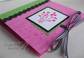
As promised, here are more Post-It holders… numbers two and three. These two are very similar. By my third one I was getting the hang of it but then I attemped a fourth and got a bit too cocky so it went wrong again!

The “friend” one uses Gable Green, while the other uses Green Galore.


Stamps: Pocket Silhouettes
Cardstock: Pink Passion, Green Galore, Basic Black, Whisper White
Ink: Pink Passion, Versamark®, Green Galore
Accessories: Scallop Edge Punch, Black Gingham Ribbon, Round Tab Punch, Square Scallop Punch


All products by Stampin' Up! Please email me to order a catalogue, or click the picture of the catalogue on the right to view it online.
Read More » As promised, here are more Post-It holders… numbers two and three. These two are very similar. By my third one I was getting the hang of it but then I attemped a fourth and got a bit too cocky so it went wrong again!

The “friend” one uses Gable Green, while the other uses Green Galore.


Stamps: Pocket Silhouettes
Cardstock: Pink Passion, Green Galore, Basic Black, Whisper White
Ink: Pink Passion, Versamark®, Green Galore
Accessories: Scallop Edge Punch, Black Gingham Ribbon, Round Tab Punch, Square Scallop Punch


All products by Stampin' Up! Please email me to order a catalogue, or click the picture of the catalogue on the right to view it online.

Thursday, 1 January 2009

Sticky note holder

Happy New Year everyone!

And here's a project that's been a long time coming. I was shown the idea for it back in October by a lady called Jackie. It was only a sketch on a piece of scrap paper and she hadn’t even tried it herself at that point. We both took the idea away and, predictably, while she developed it with a friend, I left it languishing in the bottom of my trolley and ignored it.

When I finally got round to having a go, it went horribly wrong so, when I saw Jackie again the other night, I asked her to put me straight.

Another template and another attempt and this is what I’ve come up with. I had to adapt Jackie’s template to accommodate the rather fat pens I bought (don’t go looking for them – they came from Woolies) but, several evenings of rather unseemly language later, and I have this.

This is my first semi-successful attempt. I cut the ribbon much too short so tried to compensate by cutting semi-circles out of the cover… but the ribbon is still too short. I’ll have to give it to someone who’s very good at tying ribbons.

Inside there’s a little square “loop” for the pen and a pad of Post-its.

I’d explain how to make it but I’d only get in a mess. I have more of them to show you soon. You have been warned.

Stamps: Best Wishes and More
Cardstock: Tempting Turquoise, Pretty in Pink, Whisper White
Paper: Petals & Paisley (retired but still available)
Ink: Tempting Turquoise
Accessories: ¼” Grosgrain Ribbon - Tempting Turquoise, ½” circle punch

All products by Stampin' Up! Please email me to order a catalogue, or click the picture of the catalogue on the right to view it online.


Read More » Happy New Year everyone!

And here's a project that's been a long time coming. I was shown the idea for it back in October by a lady called Jackie. It was only a sketch on a piece of scrap paper and she hadn’t even tried it herself at that point. We both took the idea away and, predictably, while she developed it with a friend, I left it languishing in the bottom of my trolley and ignored it.

When I finally got round to having a go, it went horribly wrong so, when I saw Jackie again the other night, I asked her to put me straight.

Another template and another attempt and this is what I’ve come up with. I had to adapt Jackie’s template to accommodate the rather fat pens I bought (don’t go looking for them – they came from Woolies) but, several evenings of rather unseemly language later, and I have this.

This is my first semi-successful attempt. I cut the ribbon much too short so tried to compensate by cutting semi-circles out of the cover… but the ribbon is still too short. I’ll have to give it to someone who’s very good at tying ribbons.

Inside there’s a little square “loop” for the pen and a pad of Post-its.

I’d explain how to make it but I’d only get in a mess. I have more of them to show you soon. You have been warned.

Stamps: Best Wishes and More
Cardstock: Tempting Turquoise, Pretty in Pink, Whisper White
Paper: Petals & Paisley (retired but still available)
Ink: Tempting Turquoise
Accessories: ¼” Grosgrain Ribbon - Tempting Turquoise, ½” circle punch

All products by Stampin' Up! Please email me to order a catalogue, or click the picture of the catalogue on the right to view it online.